In web development, designing an accessible loading button is a real head-scratcher. There's no easy one-size-fits-all solution, but understanding the various approaches improves your ability to make accessible experiences. So, how do we make a loading button accessible?

The Straightforward Approach
Let's begin with what seems the most straightforward: just slap on a spinner and call it a day.
There are multiple ways of implementing a loading spinner. Here I have implemented it using solely CSS, so the spinner is not detected by screenreaders. The details of the styling are not important, but I promise I’ll share with you the whole snippet at the end of this post. The most important thing is it hides the text for visual users and adds a spinner.
Here’s an abstraction:
<button className={isLoading ? "isLoading" : ""}>
  Submit
</button>

// Styles for button and spinner:
button.isLoading {
  // Make text visibibly hidden, but available for screenreaders
  color: transparent;

  &::after {
    // ... Spinner details
  }
}
This approach has its pitfalls. While visually it indicates loading, it does nothing to communicate this state to users relying on assistive technologies. The text is still available for screenreaders, but it only says “Submit”:

One easy way to improve this, is to change the aria-label of the button while loading:
<button
  aria-label={isLoading ? "Loading" : ""}
  className={isLoading ? "isLoading" : ""}
>
  Submit
</button>
Now a screenreader will read “Loading” if the loading status is changed.
We have actually made an accessible loading button!
We could end this article there, but one common issue for a loading button is to prevent users submitting while loading status is active.
But disabling a button has caveats you should be aware of.
The Disabled Attribute: A Common Misstep?
It might seem logical — disable the button while the action is in process:
<button
  aria-label={isLoading ? "Loading" : ""}
  className={isLoading ? "isLoading" : ""}
  disabled={isLoading}
>
  Submit
</button>
This prevents any interaction with the button, so multiple requests won’t be sent. It also adds some styling, indicating for visual users the button is not interactive. For screenreaders, it will be read as “Loading, disabled, button”, which seems swell.
However, disabled may also be problematic for screenreaders. When a button is disabled, it's removed from the tab navigation. This entails if a keyboard user is tab-ing through a page, a disabled button will not be focused.
Not being able to find a button doesn’t sound too accessible to me — so what are the alternatives?
Aria-disabled: Interactivity Maintained
Here's where aria-disabled steps in. Unlike the traditional disabled attribute, it keeps the button interactive, allowing focus, but still telling a screenreader the button is disabled:
<button
  aria-disabled={isLoading}
  aria-label={isLoading ? "Loading" : ""}
  className={isLoading ? "isLoading" : ""}
>
  Submit
</button>
One important thing to remember, is that it’s an aria- property, so it only affects screenreaders. It does not affect styling or prevent submits.
To make aria-disabled also visible for sighted users, you can simply style the button if aria-disabled is set:
button[aria-disabled="true"] {
  cursor: not-allowed;
  opacity: 0.3;
}
To prevent submits, you can do an early return on your submit function:
function handleSubmit() {
  if (isLoading) {
    return;
  }
}
So now we have two possible implementations of a disabled, loading button.
But you may also have seen aria-busy — is that something you should be using?
Aria-busy: Maybe relevant?
aria-busy tells the screenreader an element is “busy”, which sounds suitable for a loading button:
<button
  aria-busy={isLoading}
  aria-label={isLoading ? "Loading" : ""}
  className={isLoading ? "isLoading" : ""}
>
  Submit
</button>
But aria-busy might not work as you expect. After you press the button, it won’t immediately notify you about its busy-ness; it still reads “Submit” then “Loading”. You only get the word “busy” included with the screenreader if you enter the element from somewhere else, such as leaving the button and refocusing it. Then it will read “Loading, busy, button”. This shows the importance of updating the aria-label to communicate its state.
There’s also another gotcha with aria-busy you should be aware of. It hides the busy element’s children from screenreaders. This is by design, as aria-busy is intended to prevent the screenreader to read incomplete elements.
So in the case below, it would not read the loading text:
<button
  aria-busy={isLoading}>
  className={isLoading ? "isLoading" : ""}
>
  {isLoading ? <Spinner aria-label="loading" /> : "Submit"}
</button>
We have multiple implementations of loading now — what does the industry use?
Learning from the industry
It's instructive to look at how various UI libraries handle this issue. Here solutions vary from only setting disabled, only setting aria-disabled, only setting aria-busy or a mix.
Let’s first look at what some global libraries does it:
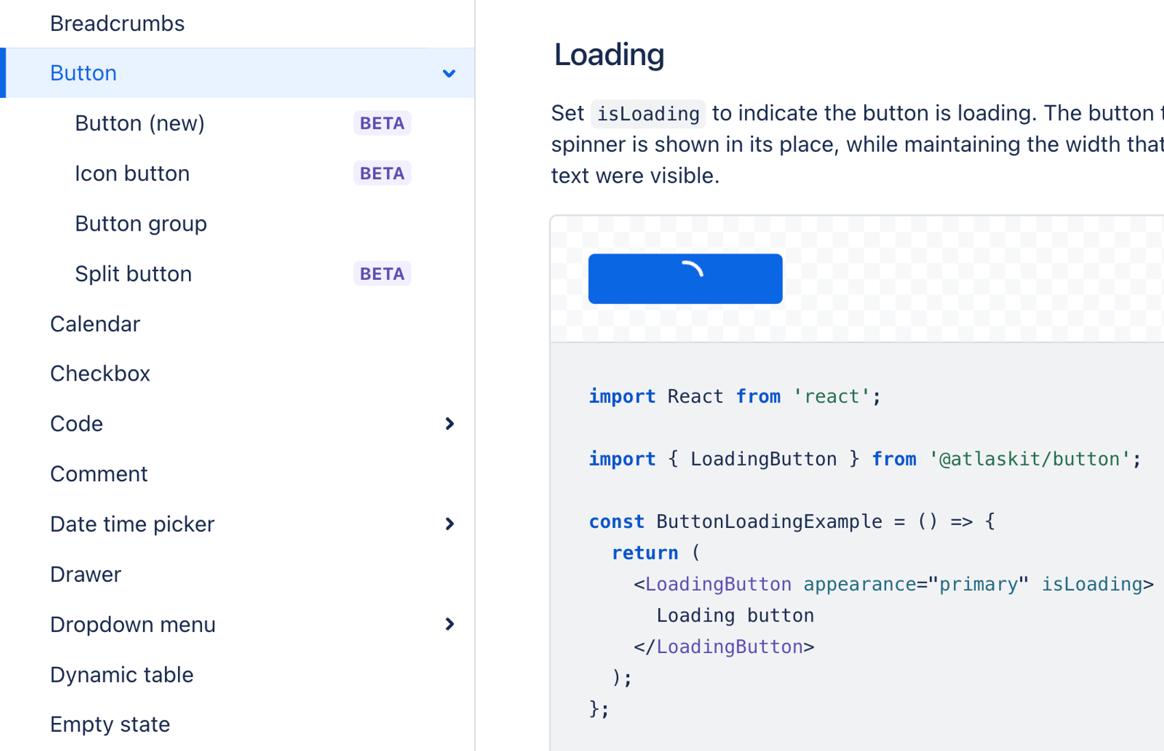
- Atlassian: aria-disabled. https://atlassian.design/components/button/examples#loading
- Material UI: disabled. https://mui.com/material-ui/react-button/
- shadcn: disabled. https://ui.shadcn.com/docs/components/button#loading
In Norway, some of the biggest libraries also have a mix of decisions:
- Common public library, designsystemet: aria-disabled. https://storybook.designsystemet.no/?path=/docs/felles-button--docs#bruk-av-spinner-til-å-lage-en-knapp-som-laster
- Entur: aria-busy and aria-label. https://design.entur.no/komponenter/knapper/button
- Vy: aria-busy and disabled. https://spor.vy.no/components/button
- Nav: disabled. https://aksel.nav.no/komponenter/core/button#buttondemo-loading
Lets comment some of these choices.
Let’s just first comment the use of disabled — wasn’t that a misstep?
First of all, you should avoid the use of disabled, and instead use feedback text and early return. But in the case of a loading button, it is OK to use disabled, assuming the wait won’t be too long. For a loading button the user may already have focus on the button, and you can tell the user what’s happening by changing text from “submit” to “loading”.
With disabled the user may know that the button will be unavailable to tab for a little while, but it’s still possible to use voiceover-button + arrows to navigate to it.
If the waiting time is too long, e.g. more than 10 seconds, a user may be confused to what is happening. Nav suggests in this case to add more feedback with text, progress bar or use a loading skeleton.
Why might libraries have such a range of decisions?
One answer is simply that there’s not only one correct solution. There are multiple ways to understand a button is in a loading state. Some screenreader-users may be used to one way, and another group may be used to another way. You just have to user test with your audience.
Another aspect is that the above mentioned libraries use default values for loading state. But there may be situations where one method is better, and it’s possible for consumers to overwrite.
Conclusion
In summary, creating an accessible loading button requires a nuanced understanding of different attributes and their implications for accessibility. What a perfect solution is, has a boring answer: it depends. It depends on the context and the users' expectations. By examining various approaches and understanding their trade-offs, developers can make more informed decisions and create more inclusive web experiences.
As promised, here’s the implementation of the loading button:
<button className={isLoading ? "isLoading" : ""}>
  Submit
</button>

button.isLoading {
  // Make text visibibly hidden, and keep the button's width
  color: transparent;
  /* Hide direct children, e.g. icon */
  & > * {
    visibility: hidden;
  }

  position: relative;

  // Spinner
  &::after {
    content: "";
    display: block;
    position: absolute;
    inset: 0;
    margin: auto;

    border: 2px solid rgba(0, 0, 0, 0.1);
    border-top: 2px solid var(--color-foreground-primary);
    border-radius: 50%;
    width: 1rem;
    height: 1rem;
    animation: spin 1.5s linear infinite;
  }
}
How would you implement an accessible loading button?