Whether you're making a library or making React components for your own sake, there's one technique you must know: polymorphism. It's when one thing can be multiple shapes, as when a button can act as a link. Used correct, it can save you from maintaining many variants, and at the same time give your users the flexibility they need.
In this text I will show you how to utilize two of the most known ways of implementing polymorphism in React: the "as"- and "asChild"-patterns.
5 min read
·
By Marcus Haaland
·
December 1, 2023

I have made a lovely, Christmas-inspired button. Take a look!
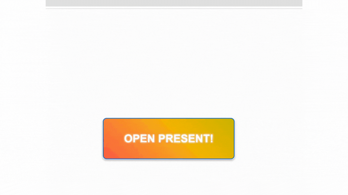
It has a nice animation as it rests, and it really comes to life when you poke it. Implementation and use looks like this:
export function Button(props: any) {
  return (
    <button className="button" {...props} />
  );
}

<Button onClick={() => alert("🎉")}>Open Present!</Button>
As you can see above, it's just a button right now, but I want to be able to use it as a link as well.
How do I achieve that?
as pattern
Making a link look like a button is a common problem. This can be solved with the as pattern.
One of the ways to implement the as pattern is to exploit a very special property in JSX: If an element has an uppercase letter, React will interpret it as an element type. Then React will render the element type based on the variable's value.
Here we exploit this, by moving the value from the as prop into the variable Tag:
export function Button(props: any) {
  const Tag = props.as || "button";
  return (
    <Tag className="button" {...props} />
  );
}
So if as has the value "a", the element type will be an anchor tag, and not a button:
<Button onClick={() => alert('🎉')}>Open Present!</Button>

<Button as="a" href="/party">Join Christmas Party</Button>
By the way, there is nothing magical about using exactly "Tag". Another common name is “Component”, but you can use whatever you want as long as the variable is capitalized.
The result looks like this. Notice that in the top left corner of the tooltip it appears that one button is now of element type <a>:

TypeScript with the as pattern
Right now we have no type safety, so consumers of the component can pass in all sorts of weird stuff, including invalid element types.
To achieve the correct typing of as, we can type the props to a generic type T, and let it inherit from ElementType. This means that the as props can now be valid element types, such as <a> or <button>:
import React, { ElementType, ComponentPropsWithoutRef } from "react";

type ButtonProps<T extends ElementType> = {
  as?: T;
} & ComponentPropsWithoutRef<T>;
To get the proper typing of the props, we use ComponentPropsWithoutRef. We pass it our generic type, so if send invalid props, such as trying to set href for as="button", we will get a warning.
Further in the component, the implementation looks like this, where we also have to declare the generic type for the function:
export function Button<T extends ElementType = "button">(
  props: ButtonProps<T>
) {
  const Tag = props.as || "button";

  return <Tag className="button" {...props} />;
}
We now have a button implemented with the as pattern that allows valid element types, and will provide properly typed props!
From as to asChild
The as pattern enables polymorphism by allowing components to define handling of different element types internally. In contrast, the 'asChild' pattern offers an alternative approach to polymorphism, using the child element to define the parent's element type.
Here is the LinkButton implemented with each of the patterns:
<Button as="a" href="/party">Join Christmas Party</Button>

<Button asChild>
  <a href="/party">
    Join Christmas Party
  </a>
</Button>
The way asChild works is to send props from the parent component to the child component. In this case, the first child of the button is a link, so it is rendered as a link.
After seeing asChild in several libraries, I was surprised that this is actually not a built-in React prop. But, similar to the as prop, it has to be implemented.
Implementing asChild
With the asChild pattern, we want to render a parent as the child element's element type, but at the same time also keep the parent's props. A simple implementation of asChild might look like this:
export function Button({ asChild, children, ...props }: any) {
  return asChild ? (
    React.cloneElement(children, { className: "button", ...props })
  ) : (
    <button className="button" {...props}>
      {children}
    </button>
  );
}
If asChild is false, we render the button as is.
But when asChild is true, we use a feature you might not use every day: cloning. With React.cloneElement we clone the child element, with its element type and all its values. The other argument is possible other properties the cloned element has, and this is the place we put the parent's props. This way, the <a> tag inherits Button's style and behavior, but preserves its child element type.
This simple implementation gets the point across, but it doesn't handle situations such as style and prop crashes. The library Radix has extracted this logic in a component they call Slot.
It is therefore this implementation that I would recommend if you are going to support asChild:
import { Slot } from "@radix-ui/react-slot";

export interface ButtonProps
  extends React.ButtonHTMLAttributes<HTMLButtonElement> {
  asChild?: boolean;
}

export function Button({ asChild, ...props }: ButtonProps) {
  const Tag = asChild ? Slot : "button";
  return <Tag className="button" {...props} />;
}
When should I use as and when should I use asChild?
When it comes to choosing between as and asChild, it can be unclear which one you should go for, since both approaches can achieve similar results.
When it comes specifically to the LinkButton, I have a preference:
- Clear distribution of roles: With asChild, the distinction between which element handles styling and functionality becomes clearer. Button controls the style, while the <a> tag takes care of the navigation aspect.
- Flexibility:
asChildprovides flexibility to change the child element, such as switching from an<a>tag to a<span>, without losing the styling thatButtonprovides. - Avoid Complexity: This approach avoids the complexity that can arise from having to support multiple element types directly in
Button. With theasapproach, it is easy to have to support too many editions, which makes the code unreadable.
However, there are situations where asChild is not possible, such as with a Heading component that needs to support multiple heading levels (h1, h2, h3, etc.). Here it makes sense to change the element type directly with the as-props.
There's also a question of whether you should use polymorphism at all. When you see that things are similar, it can make sense to combine them with polymorphism. But if you have many special cases depending on the element type, it is easier to keep them separate.
Final words
There are many ways to create a LinkButton, and two of them are with as- or asChild-prop. It's a double-edged sword, since polymorphism can also make the code more complicated. But used correctly, there are tools that can make your code more readable and maintainable.
If you are curious about what lies behind the Slot implementation, Jacob Paris has a more detailed explanation here: https://www.jacobparis.com/content/react-as-child
If you want to dive even more into polymorphism and generics in TypeScript, take a look at Emmanuel Ohan's guide here: https://www.freecodecamp.org/news/build-strongly-typed-polymorphic-components-with-react-and-typescript/
