Christmas is at the door, but not only presents are being wrapped. For years your tool of choice for wrapping elements has been border. But what if I told you there exists an even more flexible and layout friendly property than this?
In this guide we will explore how box-shadow can be used as an alternative to traditional borders, and how it can solve our layout problems.

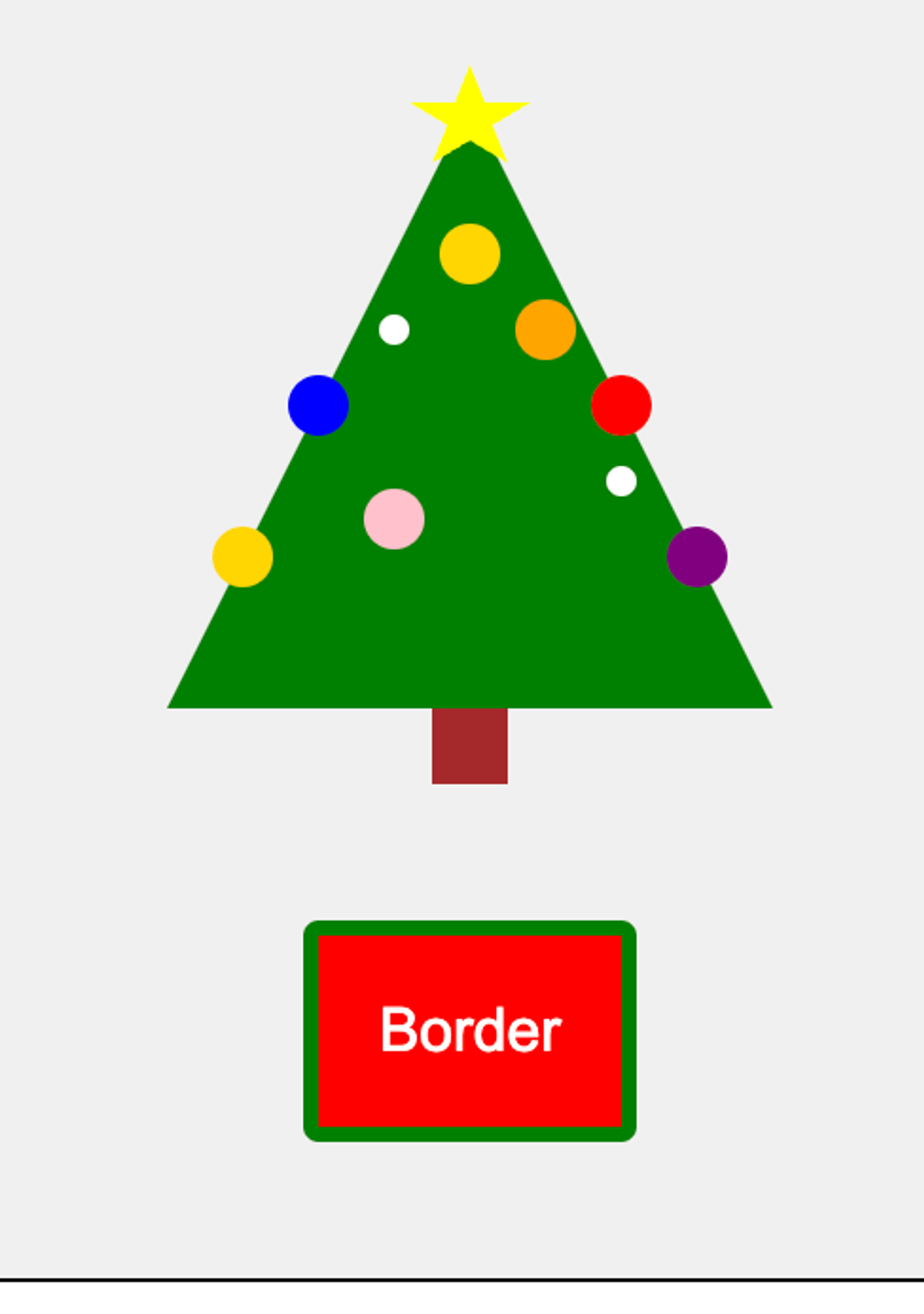
Wrapping with border
First, lets have a look at wrapping elements with the border property. Have a look beneath the tree:
Here's a challenge for you, so don't scroll further down too fast. Take a look at the following code. What do you think happens if you hover the button?
button {
  background-color: red;
  color: white;
  padding: 1rem;
  border: 4px solid green;
}

button.border:hover {
  border-width: 16px;
}
Here's the result:
Not surprising, the border of course got bigger. But it also caused a layout shift. When the border gets bigger, also the button gets bigger, and pushes elements around. This is often an unwanted effect. If you have a button in a form, you don't want the rest of the elements getting pushed when focusing a button.
I will first reveal some ways around this with border, and then suggest another solution using box-shadow.
Avoid layout shift using fixed height and width
The cause of the layout shift is that the border is a part of the element's actual size. So if an element is bigger, logically it will also move other elements around.
In form elements, including button, border and padding is baked into the element's size. This is through the CSS-declaration box-sizing: border-box. This makes it much simpler to control the size of an element, and it also something we can exploit to avoid layout shifts with border.
One solution is to define a big enough height and width, so the increased border size does not exceed the size it already has:
button {
  background-color: red;
  color: white;
  padding: 1rem;
  border: 4px solid green;
  width: 140px;
  height: 100px;
}

button.border:hover {
  border-width: 16px;
}
If the included border-width is not greater than the height and width that have been set, it will not lead to a layout shift:

Avoid layout shift by calculating the padding
Another solution to avoid layout shift is to calculate padding with regard to border-width. As the border-width increases, we also decrease the padding, so the button's size remains the same:
button {
  --border-width: 4px;
  background-color: red;
  color: white;
  padding: calc(1rem - var(--border-width));
  border: var(--border-width) solid green;
}

button.border:hover {
  --border-width: 16px;
}

button.with-transition {
	transition: padding 0.3s ease, border 0.3s ease;
}
The result looks like this, here a button with and without transition:

As you can see, it seems to work fine without transition. But if you look closely at the package with transition, it's as if the content is trying to jump out. The reason is that padding changes size at a different rate than border-width.
The conclusion is that it is possible to calculate with padding, but only if you are not going to use transition — or want to create a stylish effect.
Use shadows as a border
Since borders have some challenges, we can rather look to another tool. Box-shadow is another approach to wrapping an element. It behaves differently than a border, and thus has more advantages when it comes to changes. First of all, the box-shadow does not affect an element's size, which means that we do not need to take account of calculating height or padding.
Using box-shadow as a border can look like this, where we use either an outer or an inner shadow:
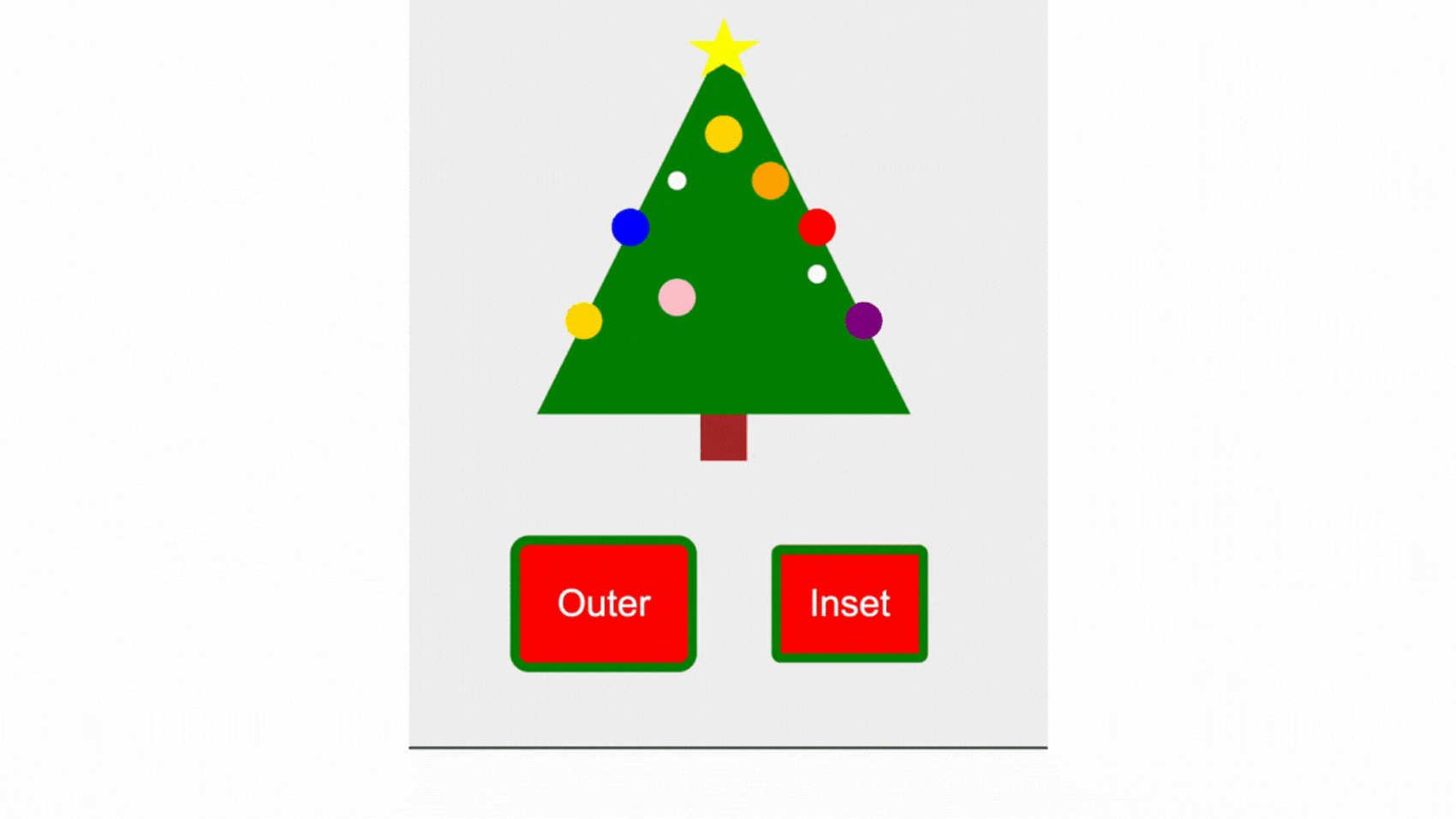
Notice that when we have an inner shadow without interactivity, it looks like a border set with border. Whilst the outer shadow is placed outside the element's size, which is different from border.
We can choose whether to have an outer or inner border with the inset value. The box-shadow property allows you to control how spread the shadow is, but when we use it as a border, we only care about 3 values: whether the border should be outside the element, the border size and the color (inset, 4px and green, respectively):
button {
  background-color: red;
  color: white;
  padding: 1rem;
  border: none;
}

button.outer {
  box-shadow: 0 0 0 4px green;
}

button.outer:hover {
  box-shadow: 0 0 0 16px green;
}

button.inner {
  box-shadow: inset 0 0 0 4px green;
}

button.inner:hover {
  box-shadow: inset 0 0 0 16px green;
}
You can just fine only use box-shadow alone to style a border, but it can also be useful to know that you can combine box-shadow and border.
Since border have certain styles that are not included in box-shadow, you may want a certain border-style when it is at rest, but an outer border using box-shadow on hover:
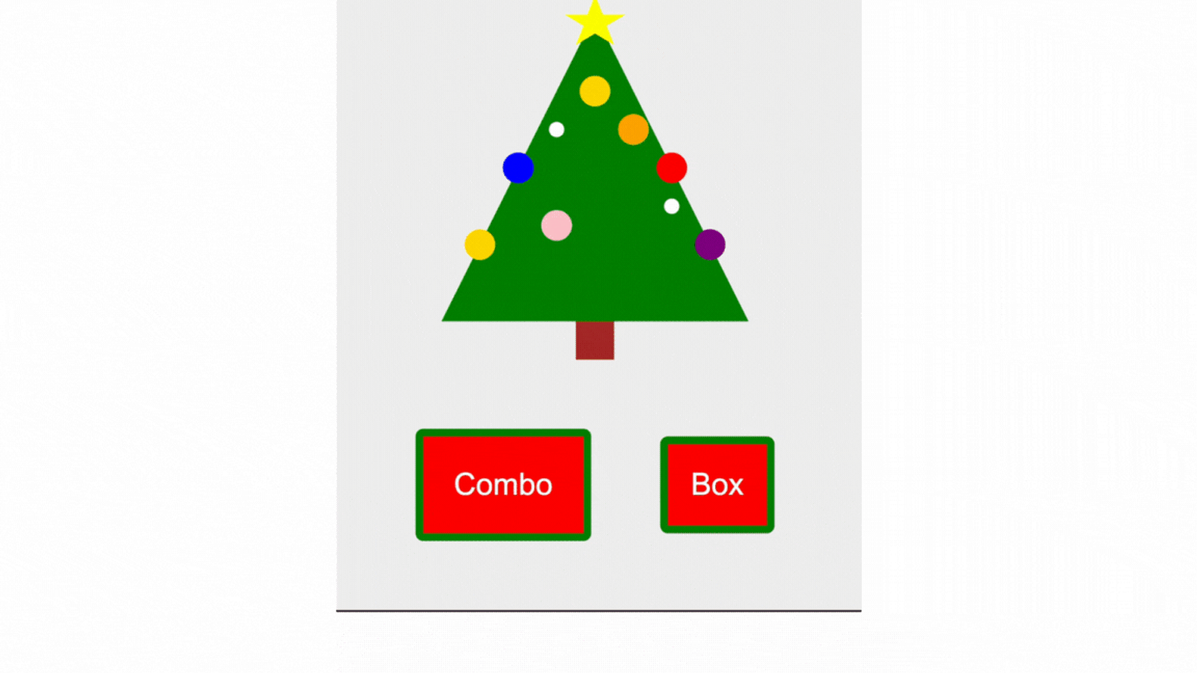
button.combo {
  border: 4px solid green;
  border-style: dotted;
}

button.combo:hover {
  box-shadow: inset 0 0 0 8px green;
}

button.box {
  border: none;
  box-shadow: inset 0 0 0 4px green;
}

button.box:hover {
  box-shadow: inset 0 0 0 8px green;
}
Should I always use box-shadow over border?
Both border and box-sizing have good cross-device support, but there may be certain browser versions and devices that override box-shadow. I have experienced that Safari 15 on the iPhone has removed the box-shadow, but this has been resolved by not allowing overriding via the appearance CSS property. Some e-mail clients report problems with box-shadow, so also this should be checked whether your styling result is as expected.
The conclusion is that you should start with borders. If you also need dynamic sizes for the border, use box-shadow. You can use it in combination or alone. But make sure to test whether the result is as expected across devices and browsers.
Final words
I think most of us have used border to wrap our elements. It works well as long as the size remains the same, but once the size is dynamic, you may want to look at other solutions. box-shadow solves this in a good good way, and is a tool you should consider the next time you need a dynamic border.