Have you ever struggled with CSS? Have you found it hard to structure a large CSS codebase, even when using methodologies like BEM or OOCSS? Have you tried using CSS-in-JS solutions, but struggled with the setup or lack of typing? Or maybe you've used Tailwind, but find the initial bundle size intimidating, or the tooling to reduce it too complex?
Stitches is a new CSS-in-JS library from Modulz and Christian Alfoni, creator of Cerebral and Overmind. It promises "Near-zero runtime, server-side rendering, multi-variant support, and best-in-class developer experience."
We'll take a look at what this means, and how Stitches compares to existing CSS-in-JS solutions like Styled Components, Emotion and Material UI.

Getting started
Stitches provides two separate libraries, @stitches/core for framework-agnostic functionality, and @stitches/react which is similar to Styled Components for React.
@stitches/core
Stitches can be used without any specific view framework, and provides us with several benefits, for example:
- Type safe CSS
- Minimal CSS size due to atomic classes
- Custom token support
We'll take a look at each one of these.
Type safe CSS
Here is a very simple example using nothing but @stitches/core:
import { createCss } from "@stitches/core";

const css = createCss({});

const root = css({
  background: "lightblue",
  padding: "1rem",
});

const content = css({
  paddingLeft: "1rem",
});

document.getElementById("app")!.innerHTML = `
<div class="${root}">
  <h1>Hello Stitches!</h1>
  <div class="${content}">Time to make some styles!</div>
</div>
`;
When using a modern editor like VS Code, we can get full autocompletion of CSS properties with Stitches:
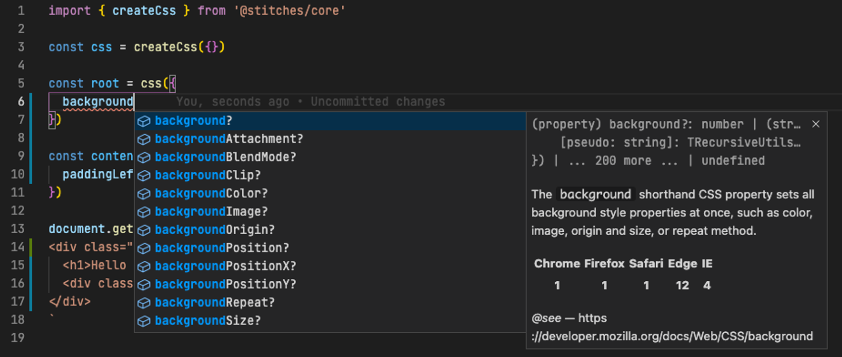
No more mistyped CSS properties!
Atomic classes
The above example renders into:
<main id="app">
  <div
    class="_initial_pl_hmLUax _initial_pb_hCFMjp _initial_pr_gPZsxG _initial_pt_dbpDZB _initial_bc_hdHkoT"
  >
    <h1>Hello Stitches!</h1>
    <div class="_initial_pl_hmLUax">Time to make some styles!</div>
  </div>
</main>
What are all these classes? Let's take a look:
._initial_pl_hmLUax {
  padding-left: 1rem;
}
._initial_pb_hCFMjp {
  padding-bottom: 1rem;
}
._initial_pr_gPZsxG {
  padding-right: 1rem;
}
._initial_pt_dbpDZB {
  padding-top: 1rem;
}
._initial_bc_hdHkoT {
  background-color: lightblue;
}
Stitches splits up our styles into separate atomic classes; this is useful because components with the same style only need a single class definition per property, e.g. _initial_pl_hmLUax, which maps to padding-left: 1rem, is used both for our root and content classes!
Atomic classes means less CSS, which makes our page load faster. This is a good thing.
Custom tokens
Even the simplest web page needs some kind of overall look and feel, which might be as simple as a preferred font and color palette, or a full theme with customized components, predefined margin sizes and all the bells and whistles.
To avoid having to repeat yourself with your selected colors or sizes, Stitches lets you define custom tokens:
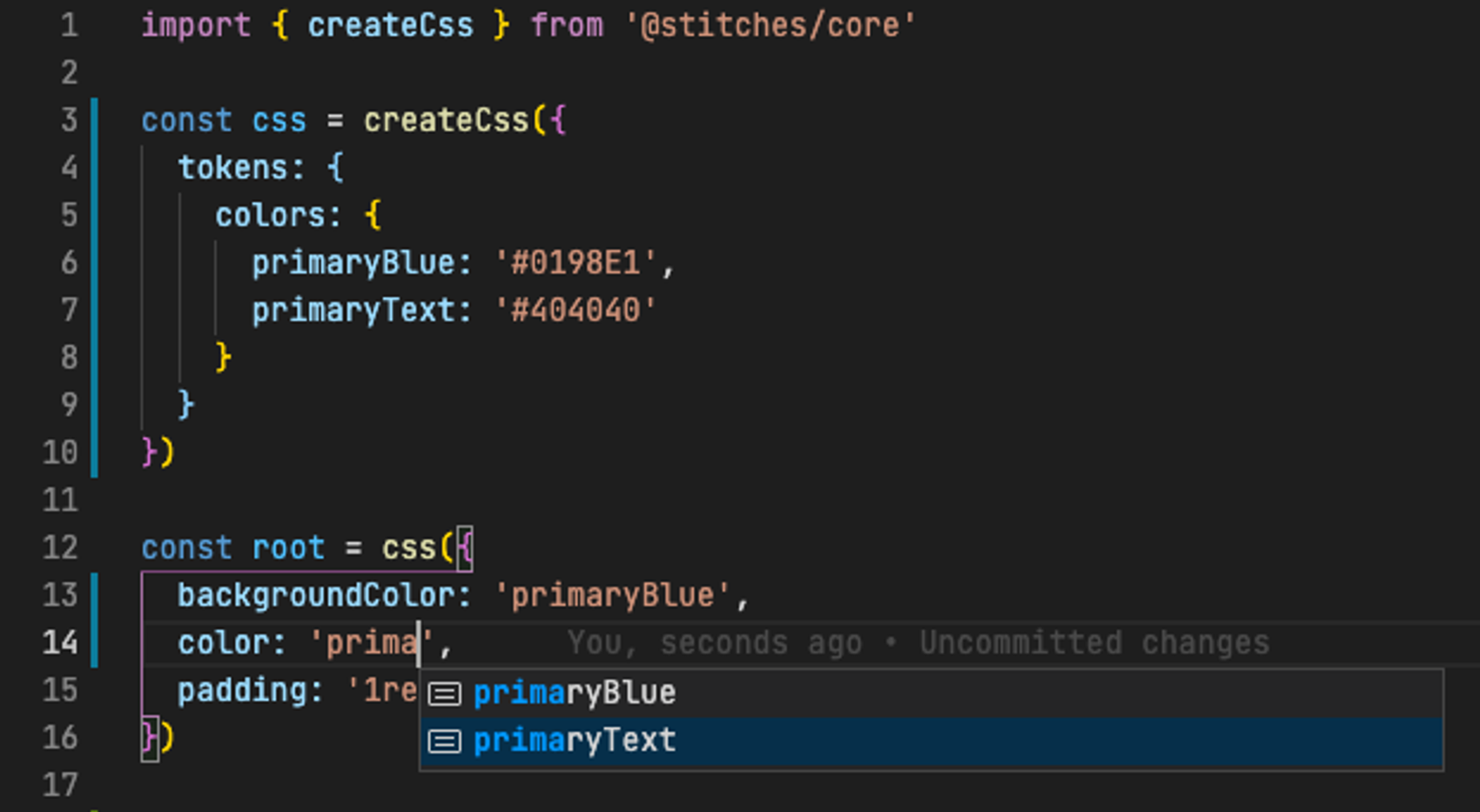
Here we can see we have defined a couple of colors, primaryText and primaryBlue. Notice how these actually show up with autocompletion when we define the classes! This also works for the other kinds of tokens like sizes, radiiand many more.
Themes
Stitches also provides an easy way to create themes with your existing tokens:
const darkTheme = css.theme({
  colors: {
    primaryBlue: "#191970",
    primaryText: "#E0E0E0",
  },
});

document.getElementById("app")!.innerHTML = `
<div class="${darkTheme} ${root}">
  <h1>Hello Stitches!</h1>
  <div class="${content}">Time to make some styles!</div>
</div>
`;
Here we create a new class darkTheme, which will override the colors for our custom tokens, generated using CSS variables:
._initial_c_bcBPUO {
  color: var(--colors-primaryText);
}
._initial_bc_iPJCVe {
  background-color: var(--colors-primaryBlue);
}
:root {
  --colors-primaryBlue: #0198e1;
  --colors-primaryText: #404040;
}
/* darkTheme */
.theme-0 {
  --colors-primaryBlue: #191970;
  --colors-primaryText: #e0e0e0;
}
While Stitches does all these things behind the covers, the end result as a developer is very intuitive and easy to use!
@stitches/react
React is pretty popular, to say the least. To make it easier to build styleable, reusable components with React, there are several great styling libraries like Styled Components, Chakra UI and Material UI.
Stitches provides a simple alternative to these, and can be used either with only @stitches/core as shown above, or with @stitches/react for a more component-based approach.
Let's look at an example:
import { createStyled } from "@stitches/react";
import { render } from "react-dom";

const { styled } = createStyled({
  tokens: {
    colors: {
      $primary: "darkblue",
      $brightText: "#eee",
    },
    radii: {
      $rounded: "8px",
    },
    space: {
      $medium: "1rem",
    },
  },
});

const Button = styled("button", {
  backgroundColor: "$primary",
  color: "$brightText",
  borderRadius: "$rounded",
  padding: "$medium 2rem",
});

const App = () => (
  <main>
    <Button>Click me!</Button>
  </main>
);

render(<App />, document.getElementById("react"));
Here we create a styled config using some custom tokens for colors, padding and border radius. To make the usage of the tokens more obvious, we prefix them with $.
One cool thing to notice is that we can mix and match tokens with regular units, as in padding: '$medium 2rem'.
Once we have our config, we can very easily create styled versions of components, for example the native button DOM element.
Variants
To build a complete design system or component library, we probably want several variants of each component, for example a small, medium and big button. Thankfully, Stitches makes this very easy:
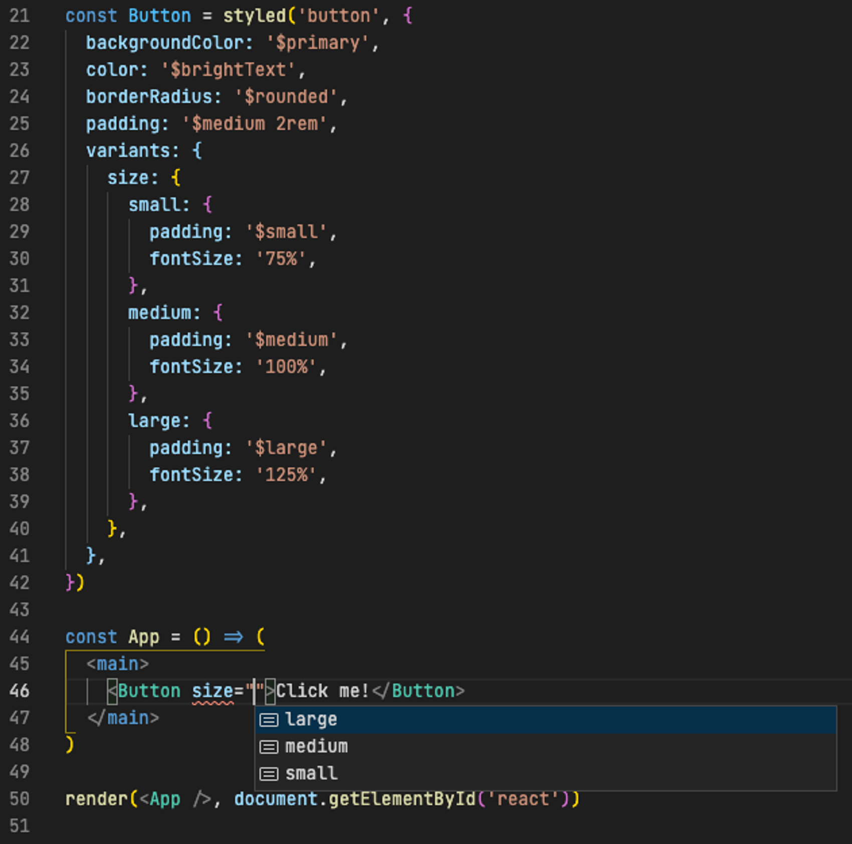
Here we have defined three size variants, each with their custom padding and font size. The result is a custom Button component with a strongly typed property size that can be one of large, medium or small. You will even get an error if you try to set a size that doesn't exist!
Final words
Stitches is a fresh breath in the ever-growing ecosystem of CSS and React components. Personally I find it extremely pleasing to work with, and would recommend everyone to try it out!
To find out more, check out stitches.dev, or install it right now with npm install @stitches/core @stitches/react and start making your own performant, responsive design system today!