Dashboards and information screens are becoming increasingly common for monitoring and displaying important, relevant information at a glance. This blog post is part two of a short series where we look at how I, without much programming skills, was able to build such a dashboard in the cloud using Google’s BigQuery and DataStudio tools.
In yesterday's post, we looked at how to get our data into BigQuery and build queries to extract the information we wanted. Now it’s time to visualize the data we have gathered using Google Data Studio.
4. Save the queries as views
As our real-time bike availability status did not contain the station names, which we would want to display in the dashboard, we simply had to join the realtime status table with a static table containing station names. Also, we wanted to calculate some euclidian distances between map locations and bike stations (yup, that rhymes). BigQuery lets you save these queries as views, which is a virtual table based on the query results. As views just gather and present data from other tables, they will be consistently up-to-date as the original tables have data added, changed or removed.
5. Visualize your data
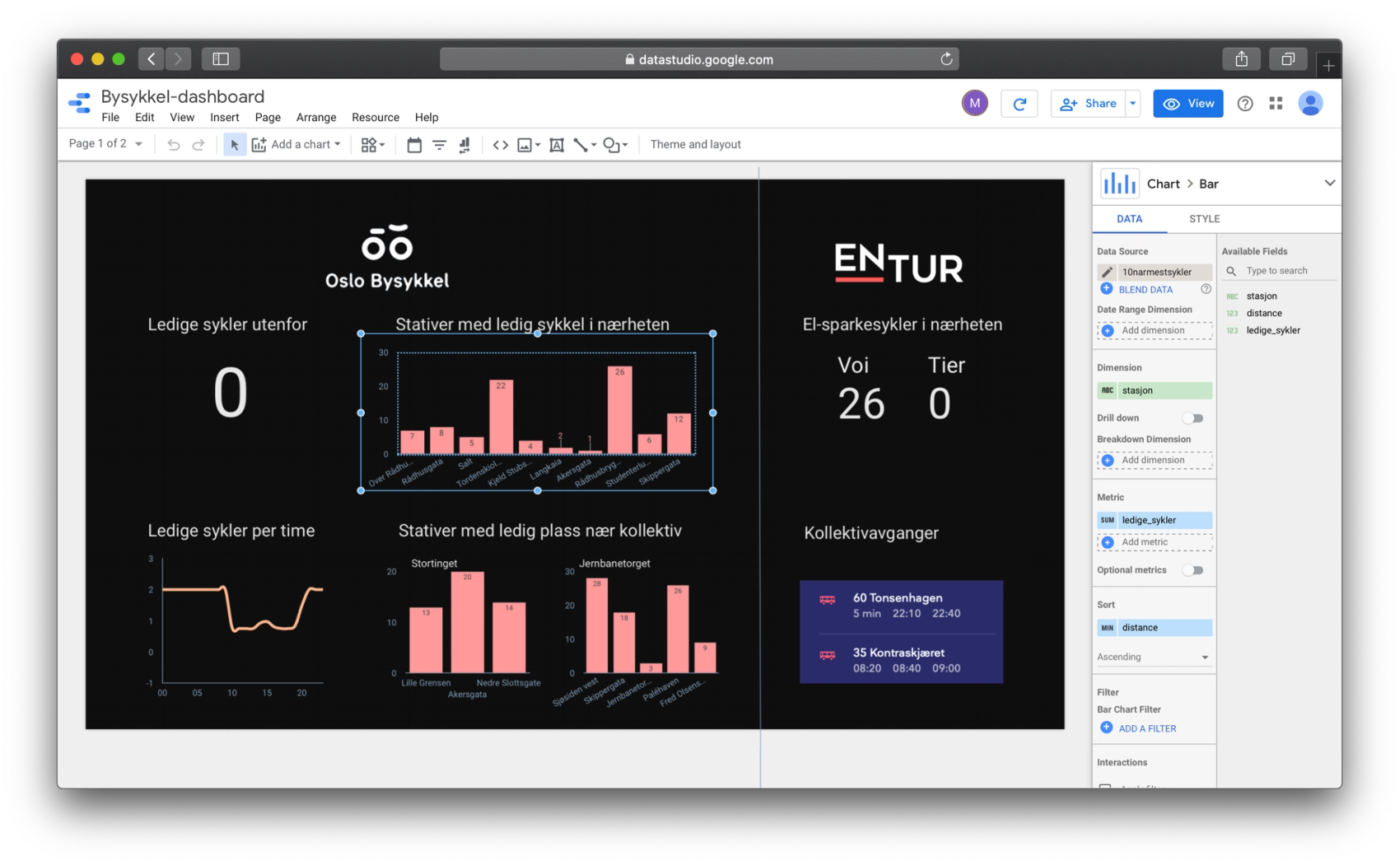
When we have finished setting up our data tables and views in BigQuery, we can start building the dashboard itself using Google Data Studio. Data Studio is built for creating simple, interactive dashboards and reports. You can connect to a bunch of different data providers and services, such as - you guessed it - BigQuery, and share the results with others. It is also possible to combine data from different sources in the same dashboard, making it a flexible and versatile tool.
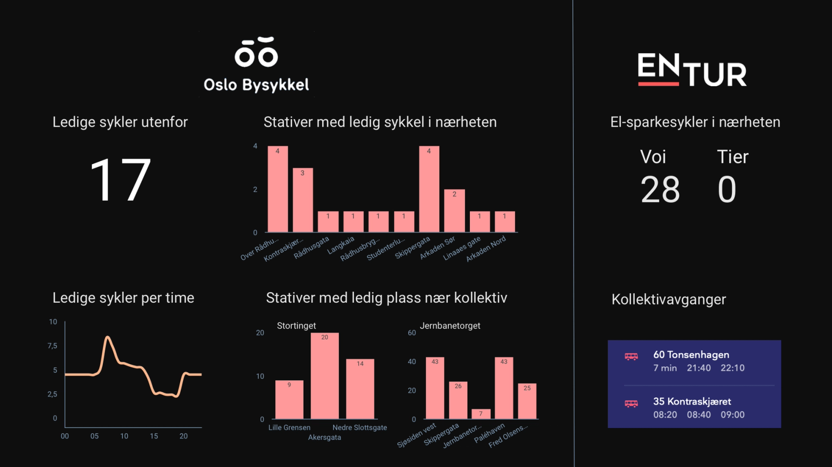
For this simple dashboard, we only needed to use a couple of different tables and views from BigQuery, such as the '10naermestsykler' view for showing the 10 bike stations with available bikes closest to our office. When you have connected your data sources, you can just make use of the drag-and-drop interface to place text, graphs, images, tables, and shapes. Data Studio offers some customization options, including Excel-like features such as calculated fields. You can also add pickers for dimensions, metrics and date ranges, so the end-users themselves can filter the data in realtime.
With the numbers and graphs all set up (and a couple of glances out the window and on official apps to check if the numbers were correct), the final part was just to clean up the design a bit. Data Studio has a bunch of different nice-looking templates you can choose from, but we wanted to keep it simple and just tweak the colors of elements to match Bekk's brand palette.
Final thoughts
While this hasn’t been a complete step to step guide, I hope you have gotten a decent overview of how to get started with BigQuery and DataStudio. I highly recommend testing out this powerful combination to build reports and dashboards, whether it is for an actual work-related project or just something convenient or fun for your own home. I don’t have much programming experience but was able to get this dashboard up and running with minimum time and effort.
For business insight purposes, these tools present an efficient, low-risk opportunity for experimenting and playing with your data to uncover new and interesting insights. It is also ideal for taking data otherwise only reachable to data engineers or scientists, and present it to not so tech-savvy users. Data Studio can, for example, automatically send out scheduled reports.
Data Studio, however, does have some limitations both in design flexibility and data manipulation. But even for those more advanced use cases, it can still be beneficial to develop and test different MVPs using DataStudio before you go on to build a full dashboard from the ground up.
But all in all: the power of the Google Cloud Platform, BigQuery and Data Studio, gives you the ability to build complex queries on giant datasets, and quickly present the results in a simple, visual manner.
Good luck!