Say you want to add a nice chart or other form of data visualization to your React app, but don't have the slightest idea of where to start. Do you write it from scratch, or do you utilize one of the many charting libraries out there? You might begin by researching d3 since it's one of the most popular data viz libraries for javascript, but you quickly get overwhelmed by the myriads of customization options and the steep learning curve. You probably don't even need all the bells and whistles that come included with it. My advice? Take a look at one of the slickest and most enjoyable charting libraries you're likely to come across this christmas - Victory.

Getting started
Victory is super easy to get started with. Start by adding it to your list of dependencies: npm i victory -S, assuming you're using npm. Now say you have some stock trading volume data that looks like this:
const data = [
  { date: "2019-12-10", volume: 16197 },
  { date: "2019-12-9", volume: 32010 },
  { date: "2019-12-8", volume: 26518 },
  { date: "2019-12-7", volume: 18606 },
  { date: "2019-12-6", volume: 16795 },
  { date: "2019-12-5", volume: 28607 },
  { date: "2019-12-4", volume: 23621 },
];
All you need to do to let Victory visualize this data for you is to pass it along to a Victory component with some props specifying which keys in the data objects to spread across which axes:
const Chart = () => {
  return <VictoryBar data={data} x="date" y="volume" />;
};
Great! Our chart is currently not displaying any numbers or labels, so lets fix that next. We can do this by wrapping our VictoryBar component in a VictoryChart, like so:
<VictoryChart domainPadding={20}>
  <VictoryBar data={data} x="date" y="volume" />
</VictoryChart>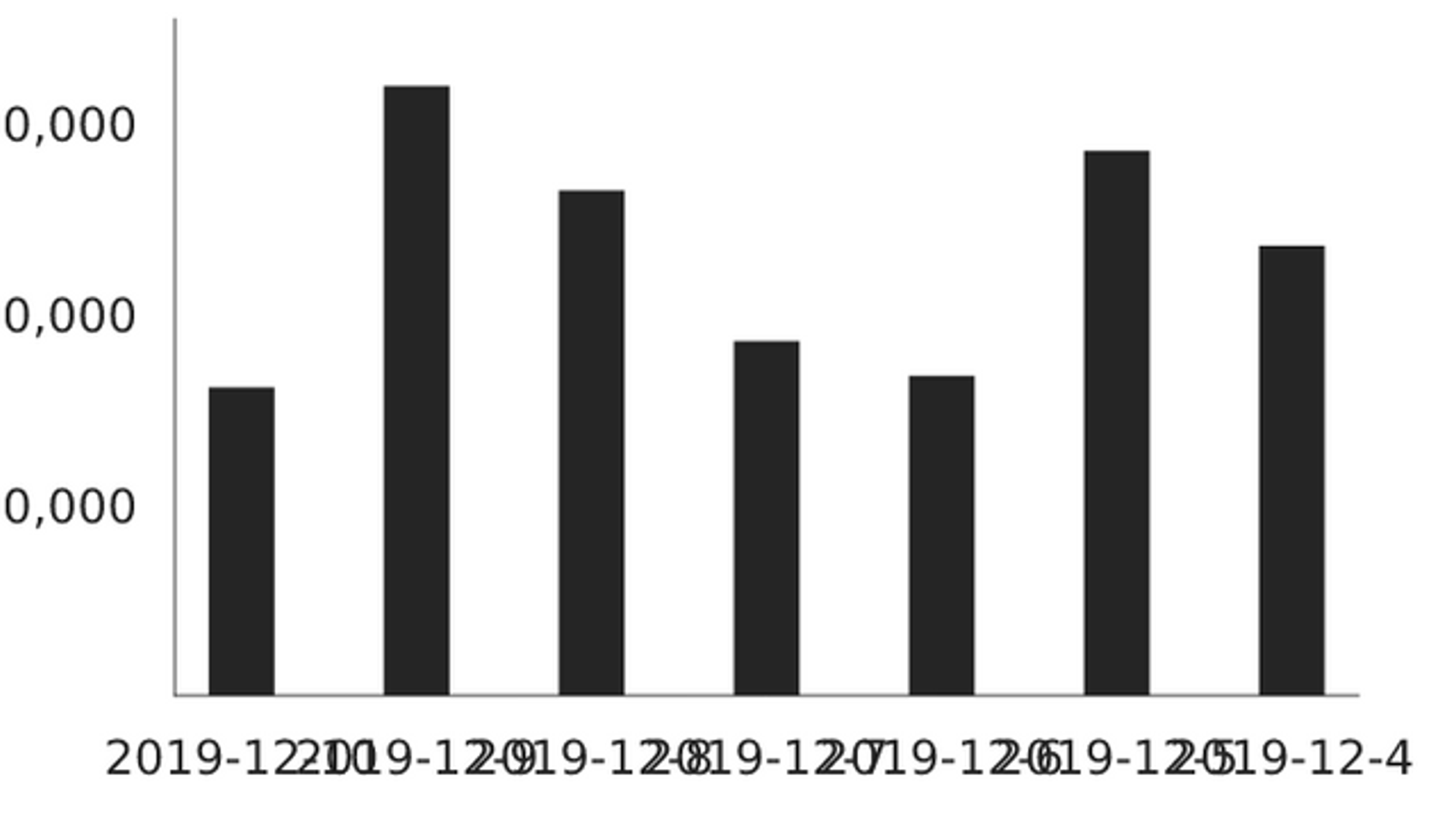
Alright, we're getting somewhere. Note that we're passing a domainPadding prop to our VictoryChart to stop the leftmost bar from overlapping the y-axis. The labels for the x-axis are overlapping each other, but this is easily fixed by introducing VictoryAxis and a handy prop called fixLabelOverlap:
<VictoryChart domainPadding={20} padding={75}>
  <VictoryAxis fixLabelOverlap />
  <VictoryAxis dependentAxis />
  <VictoryBar data={data} x="date" y="volume" />
</VictoryChart>
Not bad for only five lines of code, but there's still some room for improvement.
Getting fancy
One of the really nice things about Victory is that it is highly customizable and stylable. One way to style your chart is to pass a theme prop to the VictoryChart component. You can make your own theme or use on of the pre-defined ones with VictoryTheme:
<VictoryChart theme={VictoryTheme.material} domainPadding={20} padding={75}>
  <VictoryAxis fixLabelOverlap style={{ tickLabels: { padding: 16, fontSize: 8 } }} />
  <VictoryAxis dependentAxis />
  <VictoryBar data={data} x="date" y="volume" />
</VictoryChart>
Here we're using the pre-defined theme VictoryTheme.material which renders our chart in a nice, soothing teal tint. We're also overriding the styling for the x-axis labels to make sure that our labels are easily readable and that there's some space between each.
Stock volume data is probably not best represented by a simple bar chart, which is why it's usually presented as a line chart or something similar. Luckily for us Victory makes it dead simple to change our chart type. Simply replace VictoryBar with VictoryLine and you get this:
Want to add zoom to your chart? Simply add a containerComponent prop to VictoryChart without any props, and let Victory work it's magic:
<VictoryChart
    ...
    containerComponent={
      <VictoryZoomContainer />
    }
>
    ...
</VictoryChart>
Most of the components supplied by Victory have sensible defaults and are able to render something useful without you having to do anything at all. How about adding a tooltip showing the trading volume for a particular point on the chart when hovering over it with your cursor? Easy! Switch out the zoom container with a VictoryVoronoiContainer and give it a function telling it how to display your data:
Victory is extremely customizable and tweakable while still providing a dead simple api that is easy to pick up and play with. It also provides an easy way of styling your charts by letting you define your own themes. Although Victory delivers a ton of functionality straight out of the box, you might sometimes need a little bit more direct control over the components in your chart. Which is why Victory lets you replace every Victory component with custom ones, like a scatter plot that renders cat emojis instead of boring dots:
There is still so much more that Victory can do, and since I can't fit everything into this article I urge you to check out their official documentation and try it out for yourself.