SwiftUI, Apple's preferred UI toolkit, promises seamless integration across all Apple platforms, including of course iOS and macOS. This article delves into some challenges of using SwiftUI in a cross-platform context and suggests practical ideas for solutions.
SwiftUI’s declarative syntax enables developers to write concise and readable code. A simple SwiftUI view, such as the one below, demonstrates its elegance:
struct ContentView: View {
    var body: some View {
        Text("Hello, World!")
    }
}
This code renders a basic text view, but how it appears can vary significantly between platforms and the underlying frameworks will differ. On iOS and iPadOS the SwiftUI renders using UIKit, while on macOS AppKit is used. All transparent for the developer, some of the time.
Common Challenges in Cross-Platform SwiftUI
Layout and User Interface Adaptation
The primary challenge in in cross-platform development is ensuring that our UI looks great on all devices. Thus responsive design is key and in SwiftUI ResponsiveView is a powerful responsive tool.
The goal of ResponsiveView is to adapt its content based on the current environment, such as device type or screen size. This is particularly useful in a cross-platform context where we might want different layouts or functionalities on an iPhone, iPad, and Mac.
First, we’ll define a ResponsiveView that changes its layout based on the device being used. For simplicity, let's consider a layout that switches between a vertical stack (VStack) for iPhones and a horizontal stack (HStack) for iPads and Macs.
import SwiftUI

struct ResponsiveView<Content: View>: View {
    @ViewBuilder var content: () -> Content

    var body: some View {
        // Check the device type
        if UIDevice.current.userInterfaceIdiom == .phone {
            // iPhone layout
            VStack {
                content()
            }
        } else {
            // iPad and Mac layout
            HStack {
                content()
            }
        }
    }
}
We can now use ResponsiveView in our SwiftUI views. Here's an example where we create a simple view with two text elements that will be arranged differently depending on the device:
struct ContentView: View {
    var body: some View {
        ResponsiveView {
            Text("Hello, World!")
            Text("This is a responsive view.")
        }
        .padding()
    }
}
In this example, on an iPhone, the texts will be stacked vertically, while on an iPad or Mac, they will be aligned horizontally.
We can further enhance ResponsiveView to respond not just to device types but also to other environment properties like size classes. This allows for even more granular control over the layout and presentation based on the current context:
@Environment(\.horizontalSizeClass) var horizontalSizeClass

var body: some View {
    if horizontalSizeClass == .compact {
        // Compact width layout
        VStack { content() }
    } else {
        // Regular width layout
        HStack { content() }
    }
}
This enhancement uses the horizontalSizeClass to determine the layout, providing a more responsive design that adapts to various screen sizes and orientations.
Platform-Specific Features and Capabilities
Each Apple platform has unique features. For instance, macOS supports menu bars, while iPhones offer haptic feedback. To complicate things further, SwiftUI on iOS is based on UIKit while the older AppKit is used on macOS. As such, APIs will differ even when offering the equivalent functionality. Using conditional compilation, as shown below, we can tailor experiences for each platform:
#if os(iOS)
// iOS-specific code
#elseif os(macOS)
// macOS-specific code
#endif
Xcode will even highlight the code path of the current compilation target.
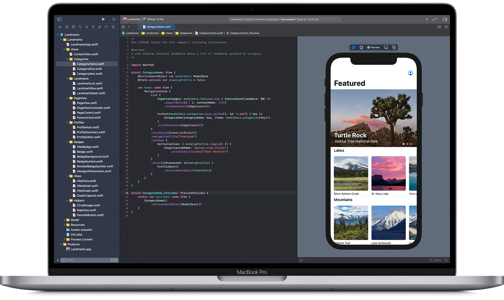
However, as shown in the screenshot above, spreading these compiler directives across our code base can be messy and steal focus from what really matters: the business logic of our app. Luckily Swift’s system for extensions og typealiases comes to the rescue.
Consider the common functionality of copying content to the plattforms pasteboard. macOS use NSPasteboard from AppKit, while iOS uses UIPasteboard. First we create a common typealias for both platforms:
#if os(macOS)
    import AppKit
    typealias CommonPasteboard = NSPasteboard
#else
    import UIKit
    typealias CommonPasteboard = UIPasteboard
#endif
Then we write an extension on CommonPasteboard:
extension CommonPasteboard {
    func copyText(_ text: String) {
#if os(macOS)
        self.clearContents()
        self.setString(text, forType: .string)
#else
        self.string = text
#endif
    }
}
Thus the functionality of coping text will be the same on both platforms:
CommonPasteboard.general.copyText(someText)Performance Optimization
Performance can vary across devices. Profiling SwiftUI apps on each target platform is essential to identify and resolve platform-specific performance bottlenecks.
Testing on real devices is also crucial. While simulators are useful, they can't perfectly replicate the performance and user experience of actual hardware. A watch is not a Mac and vise verca.
Working with Previews
SwiftUI's preview feature allows us to see near real-time UI changes as we change the views of our app. A lot can be said about working effectively with previews, but in a cross-platform context the important part is to validate how our views look on different platforms.
Luckily SwiftUI has com a long way in this regard. By using PreviewProvider and .previewDevice() we can see how our app looks on multiple devices at the same time.
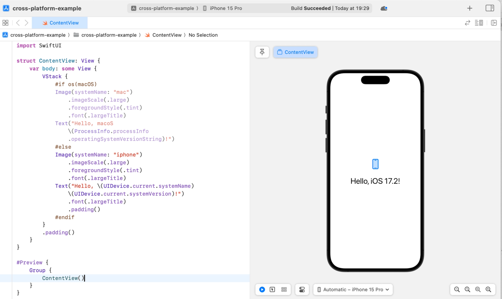
Consider this app:
import SwiftUI

struct ContentView: View {
    var body: some View {
        VStack {
            #if os(macOS)
            Image(systemName: "mac")
                .imageScale(.large)
                .foregroundStyle(.tint)
                .font(.largeTitle)
            Text("Hello, macoS \(ProcessInfo.processInfo.operatingSystemVersionString)!")
            #else
            Image(systemName: "iphone")
                .imageScale(.large)
                .foregroundStyle(.tint)
                .font(.largeTitle)
            Text("Hello, \(UIDevice.current.systemName) \(UIDevice.current.systemVersion)!")
                .font(.largeTitle)
                .padding()
            #endif
        }
        .padding()
    }
}

#Preview {
	Group {
		ContentView()
	}
}
As shown in the screenshot above, this view and prewiew will show the app on an iPhone. But what if we want to see the app on an iPad simultaneously? That’s easy! Replace the #Preview-code with:
struct ContentView_Previews: PreviewProvider {
    static var previews: some View {
        Group {
            ContentView()
                .previewDevice(PreviewDevice(rawValue: "iPhone 15 Pro"))
                .previewDisplayName("iPhone 15 Pro")
            ContentView()
                .previewDevice(PreviewDevice(rawValue: "iPad Pro (11-inch) (4th generation)"))
                .previewDisplayName("iPad")
        }
    }
}
Conclusion
Cross-platform development in SwiftUI has great potential for code re-use and simple techniques go along way towards creating a maintainable code base for apps targeting multiple Apple platforms. With the help of responsive design and flexible previews, only the app’s functionality remains and how hard can that be?*
* It’s the hardest part.