Storybook offers an awesome, interactive playground to test different props, but at a price: with it comes a straitjacket of a design.
By combining React Live and some string concatenation, you can create a solution that you have full control over, while giving your users an efficient way to get an overview of a component's capabilities.

What does a playground consist of?
Lets start with what I wanted: I wanted something that allows me to test props and dynamically see how it affects the component's behavior and style, similar to what Storybook offers:

We had opted out of Storybook in favor of flexibility, and therefore had to create something similar on our own. The example seems pretty complex - how do you build something like that from scratch?
We can break it down into some simpler functionalities:
- Component preview
- Code editor
- Change the component via form
- Generate form based on props
Preview and code editor
Lets start with React Live, which checks two boxes. It is a library that provides both component preview and a code editor. The code that is displayed is controlled by the code prop in LiveProvider:
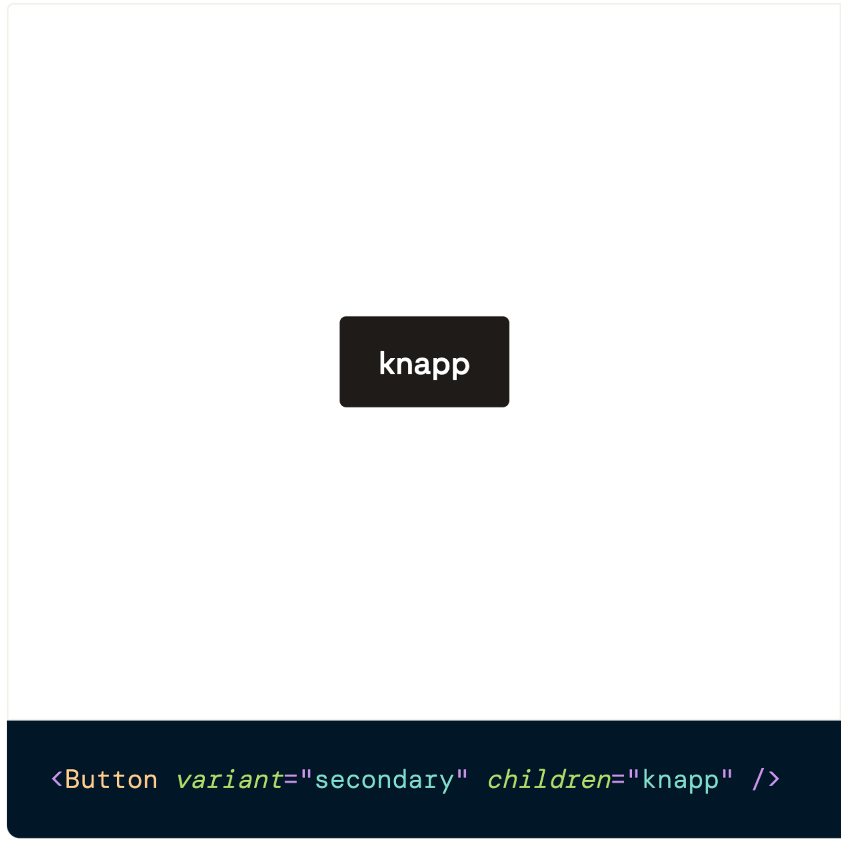
const code = `<Button variant="secondary" size="medium">Knapp</Button>`;

<LiveProvider code={code}>
 <LivePreview />
 <LiveEditor />
</LiveProvider>
Here's how this looks rendered on a page:

When the code changes, the preview is updated. It also happens if a user changes the text in the editor.
But we don't want to force users to type all variants themselves via the editor. So how can we change the code outside of the code editor itself?
How to change the component with a form
Since the preview automatically changes when the code in the LiveProvider changes, we just need to put the code for the LiveProvider in a variable so we can later update it:
const [code, setCode] = useState<string>("");We can then create a variable componentProps to keep track of the props. We make it an object, so we can keep track of which prop has which value.
Here initiated with variant and children:
type ComponentProps = Record<string, string>;

const [componentProps, setComponentProps] = useState<ComponentProps>({
  variant: "secondary",
  children: "knapp"
});
We can then update the code variable when componentProps changes. We do this via a useEffect.
Since the LiveProvider accepts a string, we turn the object into a string of key-value pairs. Then we put that string in the component name to render the component correctly:
useEffect(() => {
  const propsString = Object.entries(componentProps)
    .map(([key, value]) => `${key}="${value}"`)
    .join(" ");

  setCode(`<Button ${propsString} />`);
}, [componentProps]);
Here's the result:
We have now gone from hard-coding a string, to forming the string via props defined in an object. The result is the same, but our rewriting makes it easier for us to to add the next crucial thing: interactivity.
How to we add interactivity?
To achieve interactivity, we use a form element that will update componentProps. We create a handler handlePropChange that accepts the prop name we want to update and the new value.
Here we put the handler on a select:
// 👇 A simple function which updates a key in an object, our propname, with a new value
const handlePropChange = (propName: string, value: string): void => {
  setComponentProps({ ...componentProps, [propName]: value });
};

// ...more code

return (
  <LiveProvider code={code}>
    <form>
      <label>
      variant
        <select
          {/* 👇 We use the handler to update prop value */}
          onChange={(e: ChangeEvent<HTMLSelectElement>): void =>
            handlePropChange("variant", e.target.value)
          }
          value={componentProps.variant}
        >
          {/* 👇 We display the available prop values */}
          {["primary", "secondary"].map((option) => (
            <option key={option} value={option}>
              {option}
            </option>
          ))}
        </select>
      </label>
    </form>
    <LivePreview />
    <LiveEditor />
  </LiveProvider>
);
Now when we change value in select, we also change the preview of the component:

But different components will have different inputs depending on the props. How can we generate form elements based on props?
Generate form based on props
One way to generate form elements based on props is to put the information in an object. We define which values are possible to be displayed, and which form input we want to use to change the values. Notice that we have defined type, which we will use to switch which form element we render the values in:
interface PropRenderOption {
  propName: string;
  type: "select" | "textInput";
  options?: string[];
}

const propRenderOptions: PropRenderOption[] = [
  {
    propName: "variant",
    type: "select",
    options: ["primary", "ghost"]
  },
  {
    propName: "children",
    type: "textInput"
  }
];
After defining types, we can switch over props and render appropriate form elements, here with for example select and text-input:
const inputs = propRenderOptions.map((prop) => {
  switch (prop.type) {
    case "textInput": // 👈 Depending on type, we render a suitable form input
      return (
        <div key={prop.propName}>
          <label>{prop.propName}</label>
          <input
            // 👇 On change we update a prop with a new value
            onChange={(e: ChangeEvent<HTMLInputElement>): void =>
              handlePropChange(prop.propName, e.target.value)
            }
            type="text"
            value={componentProps[prop.propName] || ""}
          />
        </div>
      );
    case "select": // 👈 We use the same handler for the type select
      return (
        <div key={prop.propName}>
          <label>{prop.propName}
            <select
              onChange={(e: ChangeEvent<HTMLSelectElement>): void =>
                handlePropChange(prop.propName, e.target.value)
              }
              value={componentProps[prop.propName] || ""}
            >
              {prop.options?.map((option) => (
                <option key={option} value={option}>
                  {option}
                </option>
              ))}
            </select>
          </label>
        </div>
      );
    default:
      return null;
  }
});

return (
  <LiveProvider code={code}>
    <form>{inputs}</form>
    <LivePreview />
    <LiveEditor />
  </LiveProvider>
);
Here's the result:
Final words
A playground is an incredibly useful tool that effectively demonstrates the capabilities of a component. Using React Live and some string concatenation, we've seen how far we can take the functionality.
Above I have shown a basic solution to get the principles across, but here are some suggestions for further improvements:
- Move playgroundProps out into a separate file for clarity
- Also add initialProps, for a better starting point of what the component can do
- Do not return children as a prop, but between the opening and closing tag.
- Support composite components
- Find an automagical way to extract components' props (unfortunately I haven't found that, so shout out if you find a solution!)
💛 This playground is inspired by Enturs playground. Huge thanks to Magnus Rand who pointed me in the direction of how theirs was made, so I could make my own version.