One of the best things about Sanity is the balance between flexibility and default features. They deliver a great product out of the box, but to unleash the full potential of Sanity, you should spend some time customizing it to make it even better. In this article, I will show you how to create a simple custom input component that provides a visual representation of icons, enhancing your studio experience.

Data input in Sanity
Sanity provides different solutions for the user to input and change data. These out-of-the-box solutions gives the user good alternatives, but in some cases you may want something extra from your input component. Maybe you want to query and show data from a third party API? Or maybe your editors just want to see what they're choosing when they're looking for a visual component to show?
The basic input component
Let's say you have a component in your frontend that uses an Icon, and you want the editor to be able to pick this icon in Sanity studio. The icon can be added with a list of options in Sanity, doing something like this:
import * as icons from "react-icons/si";

defineField({
      name: "icon",
      title: "Icon",
      type: "string",
      options: {
        list: Object.keys(icons).map((icon) => ({
          title: icon,
          value: icon,
        })),
      },
  }),
Which gives you a list looking like this:
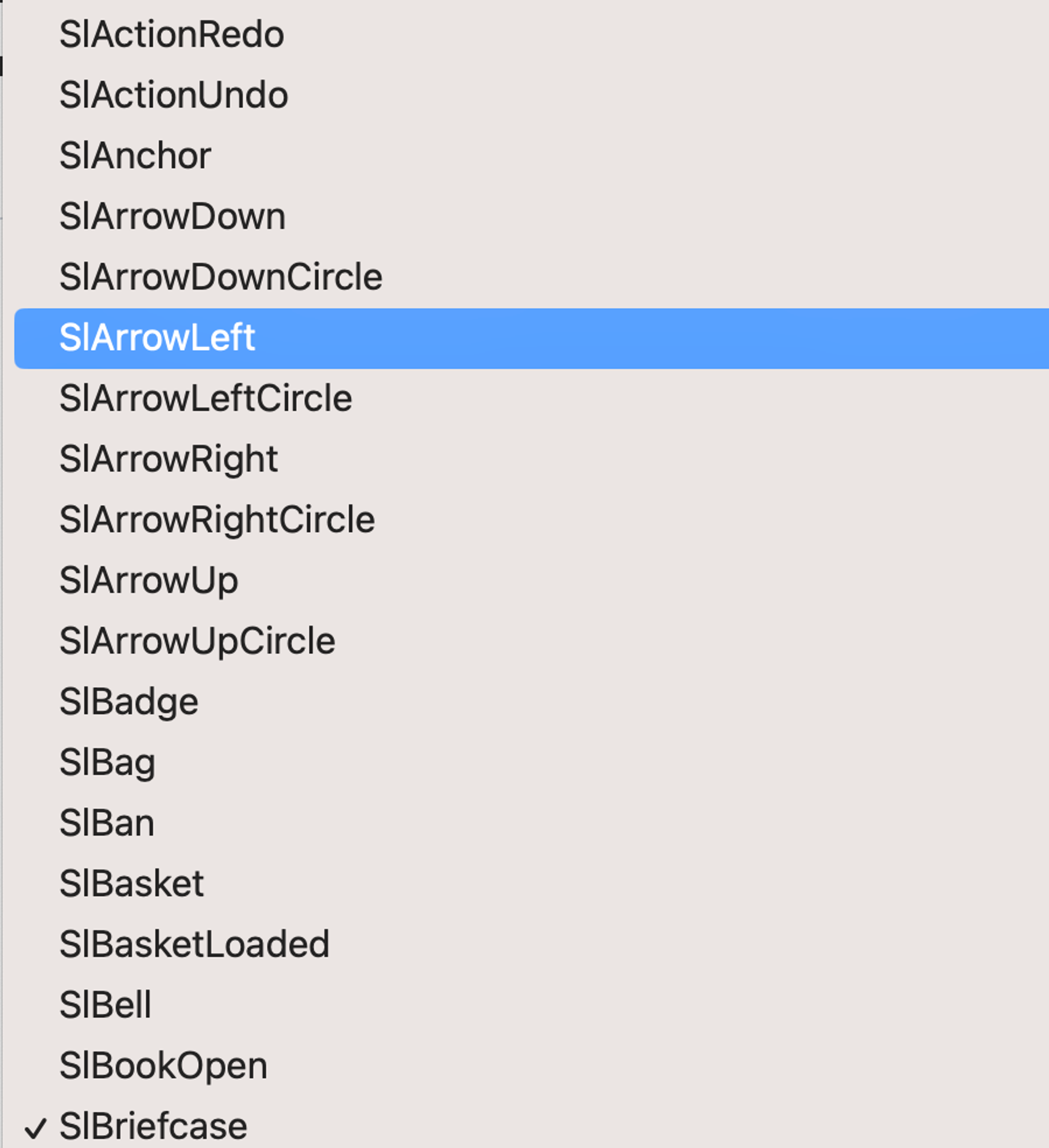
Well, this does the job, but it's also a bit of a hassle for the user to know what the icon they're choosing actually looks like. To be sure they would have to visit the page showing the icons before choosing the icon. Let's fix this by making a custom input component!
Making a custom input component with Sanity UI
Sanity UI is a React library made by Sanity that you can use when making input components. It offers primitives and some components. Using the Autocomplete component it's possible to render a React element, and we can use this to show our icons in the list. The Autocomplete component also provides a much better search functionality.
Let's start by defining the AutoComplete component:
export default function CustomIconInputComponent(props: StringInputProps) {
  return (
    <Card>
      <Autocomplete
        openButton
        id="iconInput"
        options={Object.keys(icons).map((icon) => ({
          title: icon,
          value: icon,
        }))}
        placeholder="Search for an icon"
        renderOption={(option) => (
          <Card as="button">
            <Stack padding={2}>
              <Flex align="center" gap={3}>
                <Text size={4} align="right">
                  {React.createElement(
                    icons[option.title as keyof typeof icons],
                  )}
                </Text>
                <Label>{option.title}</Label>
              </Flex>
            </Stack>
          </Card>
        )}
        renderValue={(value, option) => option?.title || value}
        value={props.value}
      />
    </Card>
  );
}
Add the input component to the field as a component:
defineField({
name: "icon",
title: "Icon",
type: "string",
components: { input: CustomIconInputComponent },
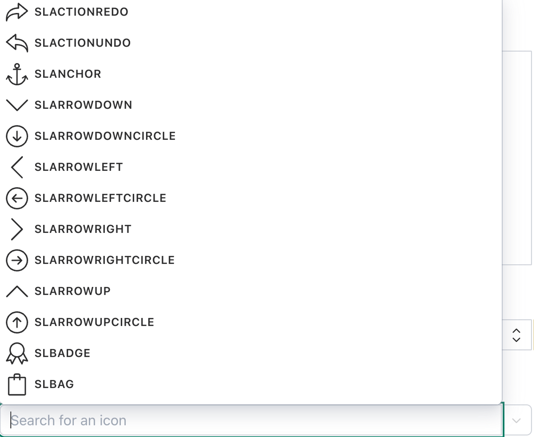
}),And we end up with a visual representation of the icons!
To actually change the value we need to add logic to set and unset the value when changed:
import { StringInputProps, set, unset } from "sanity";
export default function CustomIconInputComponent(props: StringInputProps) {
  const { onChange } = props;

  const handleChange = useCallback(
    (event: { currentTarget: { value: any } }) => {
      const nextValue = event.currentTarget.value;
      onChange(nextValue ? set(nextValue) : unset());
    },
    [onChange],
  );

  return (
    <Card>
      <Autocomplete
        openButton
        id="inputexample"
        onChange={(value) => handleChange({ currentTarget: { value } })}
        options={Object.keys(icons).map((icon) => ({
          title: icon,
          value: icon,
        }))}
        placeholder="Search for an icon"
        renderOption={(option) => (
          <Card as="button">
            <Stack padding={2}>
              <Flex align="center" gap={3}>
                <Text size={4}>
                  {React.createElement(
                    icons[option.title as keyof typeof icons],
                  )}
                </Text>
                <Label>{option.title}</Label>
              </Flex>
            </Stack>
          </Card>
        )}
        renderValue={(value, option) => option?.title || value}
        value={props.value}
      />
    </Card>
  );
}
And there we go! We now have a fully functional input component for our icons in Sanity studio.