As designers we are used to working on new domains, problems, and design challenges, and we are left with interesting reflections and insights about them. In an attempt to share some of these insights, I have written this article about the design challenges and solutions of designing for an online auction. Hopefully it can serve as inspiration or insight for other designers!
If I say “online auction”, I’m guessing that eBay is one of the first things you think of. At least that was the first site I thought of when introduced to a new project I would be designing for: an online auction for a company that leases machinery such as tractors, trucks, and wheel loaders (one of many new machines I’ve come to learn about!).
After scouring Dribbble, Pinterest, and Behance on the great search for inspiration, I soon realized that there are few insights and barely any data about online auctions and best practices, especially from a UX perspective. The online auctions I visited were often unorganized and, well, not very inspiring (hello, eBay 😬). I was left with lots of questions: how does online bidding work? What is a proxy bid? How do the users prefer to follow an auction? What type of information do they want? When do they want it?
One of the first things my team of two developers, a product owner, and myself as a UX designer did was get to know our users through interviews and surveys. It was difficult to get the user group to talk to us, and they just kept repeating “make it simple”. So, we realized that these farmers, truck drivers, and construction workers appreciate simple interfaces they can use while operating their machines, which they spend most of their days doing. They have a unique, close bond to their machines and a lot of knowledge about them, yet they are not particularly technical. What they want to be doing is using their machines, not spending lots of time online trying to place bids.

I came to understand that there are several essential elements to an online auction, and that it is absolutely critical that they work well and are simple to use, especially when the user is committing himself to bids of millions of krones. Physical auctions are fast-paced and the prices rise quickly, and this is exactly what happens during the final minutes of an online auction as well. Therefore it is imperative that the user knows how to place a bid and that the site doesn’t go down (yes, we stress-tested this multiple times 😅).
We spent many months designing and building the auction. Although we wanted to release early to get direct feedback from users, there was a lot of functionality that had to be ready before a release. I regularly tested my designs and the flow I had made on the users I could get a hold of, iterating on everything from the information architecture to the microcopy, yet we launched with a slight uncertainty of how the product would be received. After launching our product in October we have been observing and monitoring how the auction is being used, as well as communicating with actual users. This is an attempt to summarize some challenges and key learnings of how to design for an online auction, or similar platforms, such as the article I would have wanted to read many months ago.
All the information is important, so structure wisely

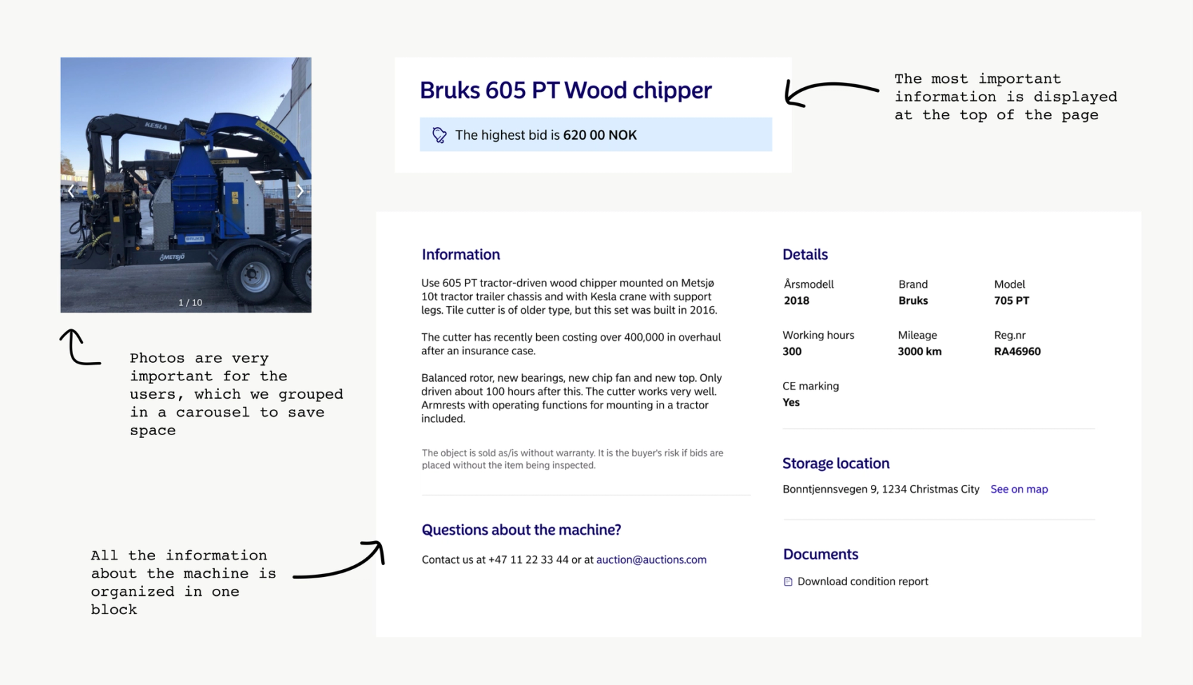
When working on the information architecture for an active auction, we realized that pretty much all the information on the page is equally important for the users. This includes photos, information about the machine, and auction-specific information. Our hypothesis is that if users can’t find enough information, they won’t bother bidding.
This is quite a lot of information, so we had to structure the page in an organized way, making it easy to scan while giving enough detail. We knew from a survey that photos were especially important, and placed a photo carousel at the top of the page, along with the name of the machine and the current highest bid. The user can get a quick overview of what they are looking at, and the status of the auction. We also located the input fields for placing bids at the top, considering this is what most users return to the auction to do - place a new bid.
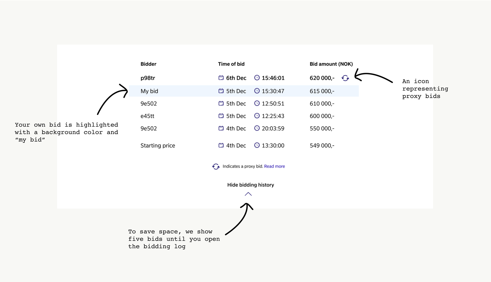
We compressed some information to save space, such as the photo carousel and an expand/collapse box for the bidding log (which can get really long - the record is 165 bids!). By following up on emails and phone calls from users asking questions about the machines, we can keep iterating on the design and information architecture to give them what they need when they need it.
Proxy bidding is logical, yet so complicated

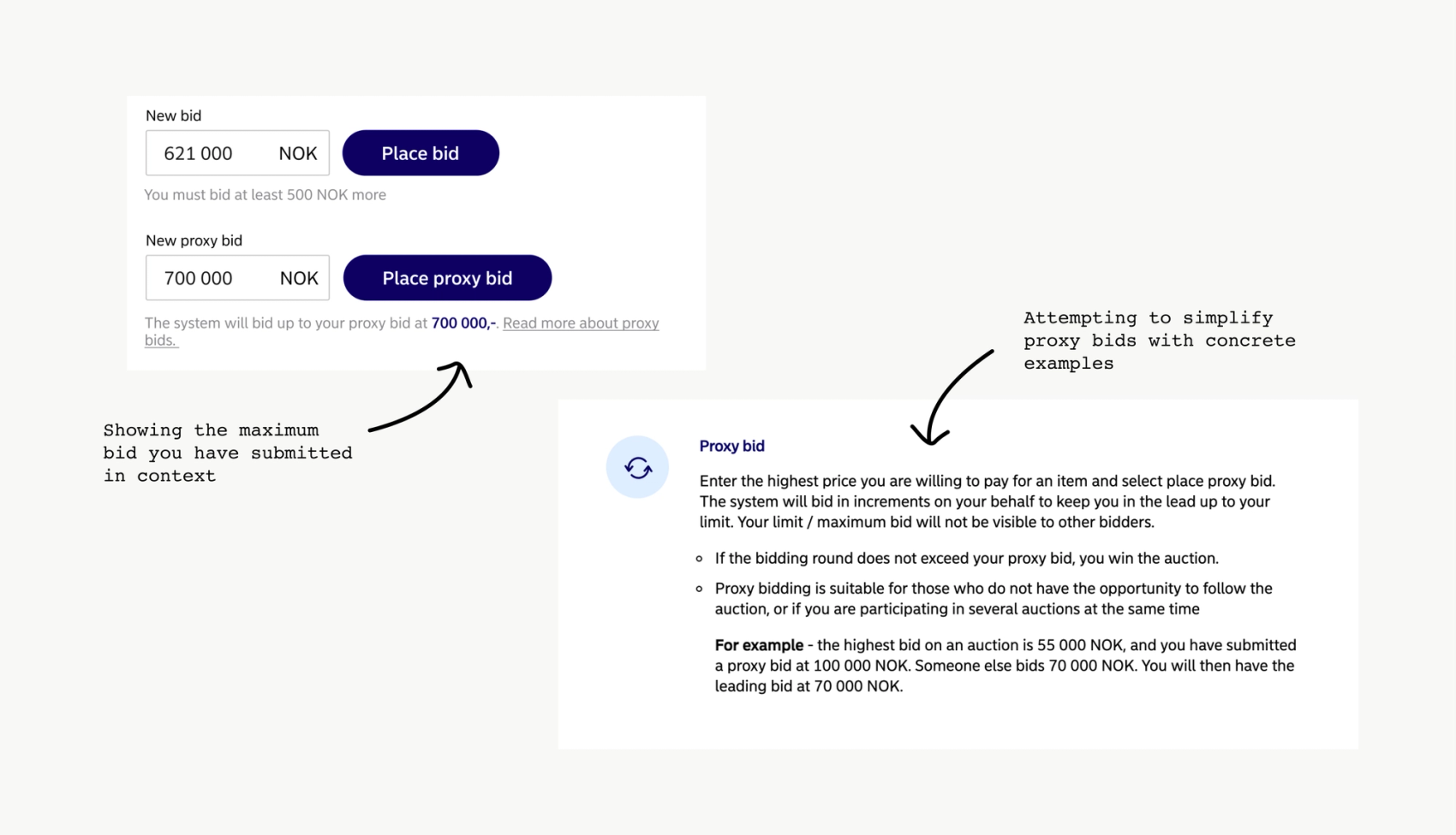
Proxy bidding is pretty straightforward - you enter the highest amount you are willing to buy the machine for and place the bid. The system then automatically bids for you until your maximum sum has been reached. Pretty simple, right? Well, we thought so too, but when writing the logic for proxy bidding we realized that there are plenty of edge cases. What happens when two users place the same proxy bid? What about when four users have submitted proxy bids and someone bids over all of them? We knew that about 50% of our users use proxy bidding, and if we thought it was complicated, it was definitely complicated for them.
To make it easier to understand we created separate input fields for regular bids and proxy bids. Many other online auctions only use one field for placing bids, which can be confusing for the user. By displaying the users’ maximum bid right beneath the input field they are always updated on what bid they have placed. We also added a link to an explanation of proxy bidding with concrete examples, and designed the bidding log to be scannable and transparent when it comes to different types of bids, more on that below.
Make bidding simple, and always give feedback

Our main activation goal is for a user to place a bid, so we have focused on making bidding understandable and simple. By displaying two separate input fields for bidding, the user gets a feeling of control, and we can keep them updated by displaying personalized contextual information.
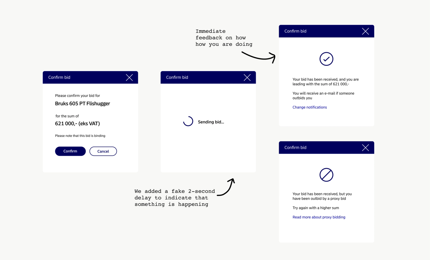
We observed that the users wanted more concrete feedback on how they were doing in the auction. Therefore we added instant feedback after they have submitted a bid, telling the user that their bid is accepted and if they are in the lead or have been outbid by a proxy bid.
We decided to add a fake 2-second delay after submitting a bid before showing the feedback. This gives the user a feeling that the system is working hard to review and accept their bid. We also prioritized sending notifications to the bidders when they have been outbid, as well as when there is two hours left of the auction. This is essential to keep the bidders updated, as well as for retention. From our insights we know that some users prefer to be notified on SMS and others on email, so we give them the choice during registration.
The bidding log can get long, so make it scannable and transparent

Transparency is imperative in an auction. The users should always be able to see a complete log of the bids that have come in, down to the second they were placed. The log should be structured well and easy to scan. Also, don’t underestimate white space!
Based on user feedback we have iterated on our bidding log a few times. Users often look for their own bids in the log to see where they stand, so we chose to highlight your own bids with a background color and changed the bidder-ID to “my bid”. We also needed a way to show which bids were proxy bids. Many auctions use an asterisk (*) to visualize a proxy bid, but we discovered that it wasn’t very scannable. A text label became invisible next to a bid, and took too much space on mobiles. We tried using a robot-icon, but it was too detailed in such a small size. We are currently using a refresh icon to show the automatic part of it, but this has been mistaken as an icon to refresh the bidding log, so we are searching for an icon that represents proxy bids even better.
Nudge the user, but stay away from dark patterns

As mentioned earlier, our ultimate goal is to get the users to place a bid. E-commerce websites sometimes use nudging to get users to buy something - such as stating that there are few items left, or that 20 people have bought the item in the last hour. We decided to use elements to nudge the user, such as saying that there have been many bids in the last hour, or that there is little time left, yet being aware of staying away from dark patterns. We never lie when displaying these numbers, and we don’t trick the users into placing bids in any way. We even get them to confirm their bids before actually submitting them, and letting them know when the sum seems too high.
Hopefully you’ve gained some insights into the challenges and potential solutions to designing user friendly online auctions. Perhaps you’ve learned something you can bring back to your own project? I’m looking forward to continuing the online auction journey, and learning even more about wheel loaders and forklifts! 😄🚜