Tired of manually changing the backgrounds in Storybook whenever you change the color theme of your component? With a few lines of code, storybook can automatically change the background color whenever certain props on your component change.
In order to understand this article you need a basic understanding of Storybook. To learn about storybook checkout their website.
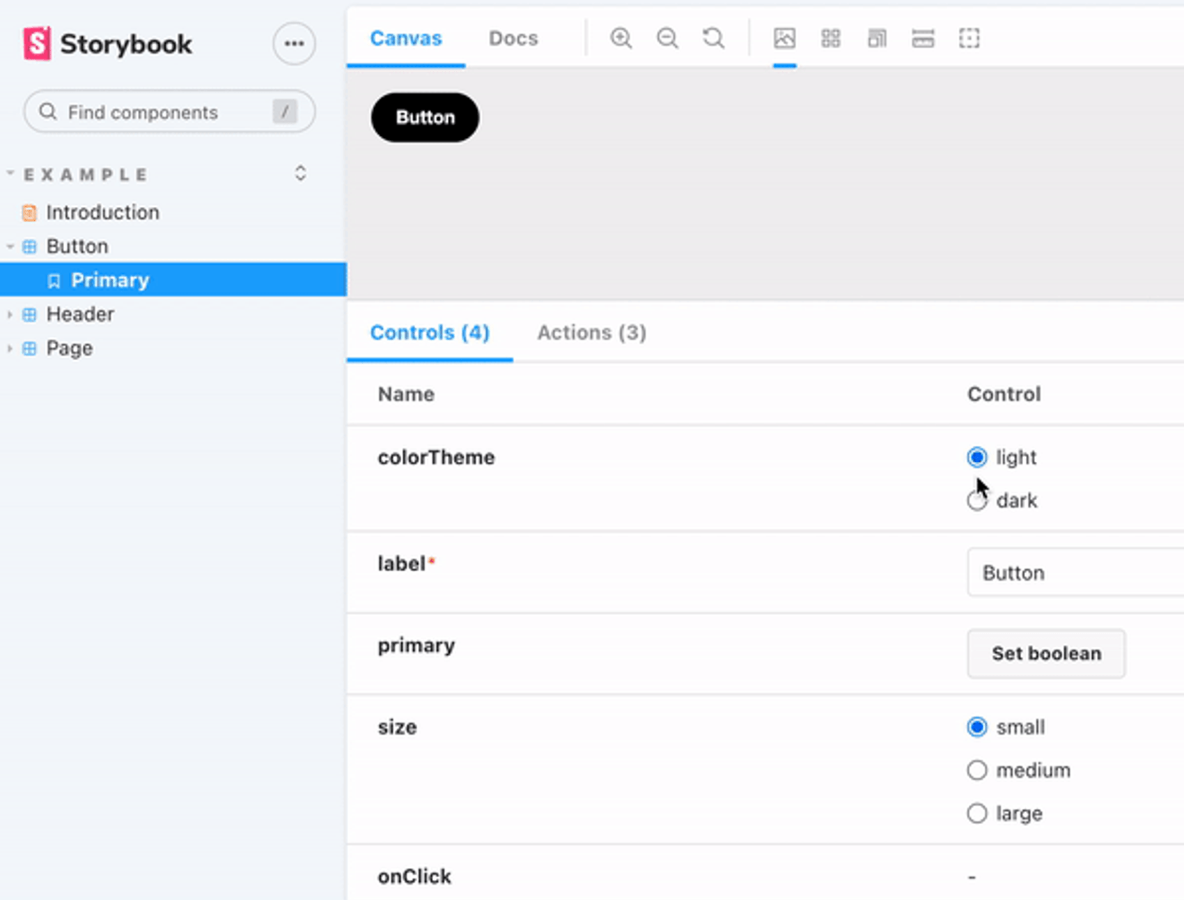
What we are making
This article will teach you how to achieve the background-changing effect in the GIF at the top of this article.
Setup
To get started you need to have a storybook project set up, and you need some component to render in Storybook. I created a new React app, and installed storybook. This can be done with the following commands:
npx create-react-app app_name
Create storybook project within root of react your project:
npx sb init
In order to change the background color in Storybook at all, you need to install the essential addons package, use the following command in your storybook project:
npm install --save-dev @storybook/addon-essentials
Now that everything is installed we are ready to create the background-changing magic.
In your component of choice, make sure you have a prop that you want to use to trigger a background-color change in Storybook. I changed the button.jsx file in my newly created react / storybook project .
I changed backgroundColor prop to colorTheme and the code looks like this:
export const Button = ({ primary, colorTheme, size, label, ...props }) => {
  const mode = primary ? 'storybook-button--primary' : 'storybook-button--secondary';
  return (
    <button
    type="button"className={['storybook-button', `storybook-button--${size}`, mode].join(' ')}style={colorTheme == "light" ? { backgroundColor:"black", color: "white"  } : {backgroundColor:"transparent", boxShadow:"inset 0px 0px 0px 3px white", color:"white"}}{...props}>
      {label}
    </button>
  );
};
This is what my final button.jsx file looks like:
import React from 'react';
import PropTypes from 'prop-types';
import './button.css';

/**
 * Primary UI component for user interaction
 */
export const Button = ({ primary, colorTheme, size, label, ...props }) => {
  const mode = primary ? 'storybook-button--primary' : 'storybook-button--secondary';
  return (
    <button
    type="button"className={['storybook-button', `storybook-button--${size}`, mode].join(' ')}style={colorTheme == "light" ? { backgroundColor:"black", color: "white"  } : {backgroundColor:"transparent", boxShadow:"inset 0px 0px 0px 3px white", color:"white"}}{...props}>
      {label}
    </button>
  );
};


Button.propTypes = {
  /**
   * Is this the principal call to action on the page?
   */
  primary: PropTypes.bool,
  /**
   * What background color to use
   */
  colorTheme: PropTypes.string,
  /**
   * How large should the button be?
   */
  size: PropTypes.oneOf(['small', 'medium', 'large']),
  /**
   * Button contents
   */
  label: PropTypes.string.isRequired,
  /**
   * Optional click handler
   */
  onClick: PropTypes.func,
};

Button.defaultProps = {
  colorTheme: "light",
  primary: false,
  size: 'medium',
  onClick: undefined,
};
Changing your story
The component's story needs to be modified. Make sure the story has a control for the prop you want to trigger the background change with. In my story I removed my existing backgroundColor argType and replaced it with my colorTheme prop from the button file. I also gave it the options dark and light and control type radio.
argTypes: {
    colorTheme: {
      control: {
        type: "radio",
      },
      options: ["light", "dark"]
    }
  }
The backgrounds parameter will also be set to not disabled, as it will be disabled from the preview file later in this guide.
parameters: {
    backgrounds: {
      disable: false
    }
  }
In addition we will add the global parameter colorTheme to the rendered component:
const Template = (args, { globals: { theme } }) => <Button {...args} colorTheme={theme}/>;This is my entire button story at this point. I have removed some of the code that was generated to highlight what we are actually using in the example. The key takeaway is that we are passing in the globals parameter theme to the button.
import React from 'react';
import { Button } from './Button';
// More on default export: https://storybook.js.org/docs/react/writing-stories/introduction#default-export
export default {
title: 'Example/Button',
component: Button,
// More on argTypes: https://storybook.js.org/docs/react/api/argtypes
argTypes: {
colorTheme: {
control: {
type: "radio",
},
options: ["light", "dark"]
}
},
parameters: {
backgrounds: {
disable: false
}
}
};
// More on component templates: https://storybook.js.org/docs/react/writing-stories/introduction#using-args
const Template = (args, { globals: { theme } }) => <Button {...args} colorTheme={theme}/>;
export const Primary = Template.bind({});
// More on args: https://storybook.js.org/docs/react/writing-stories/args
//👇 Each story then reuses that template
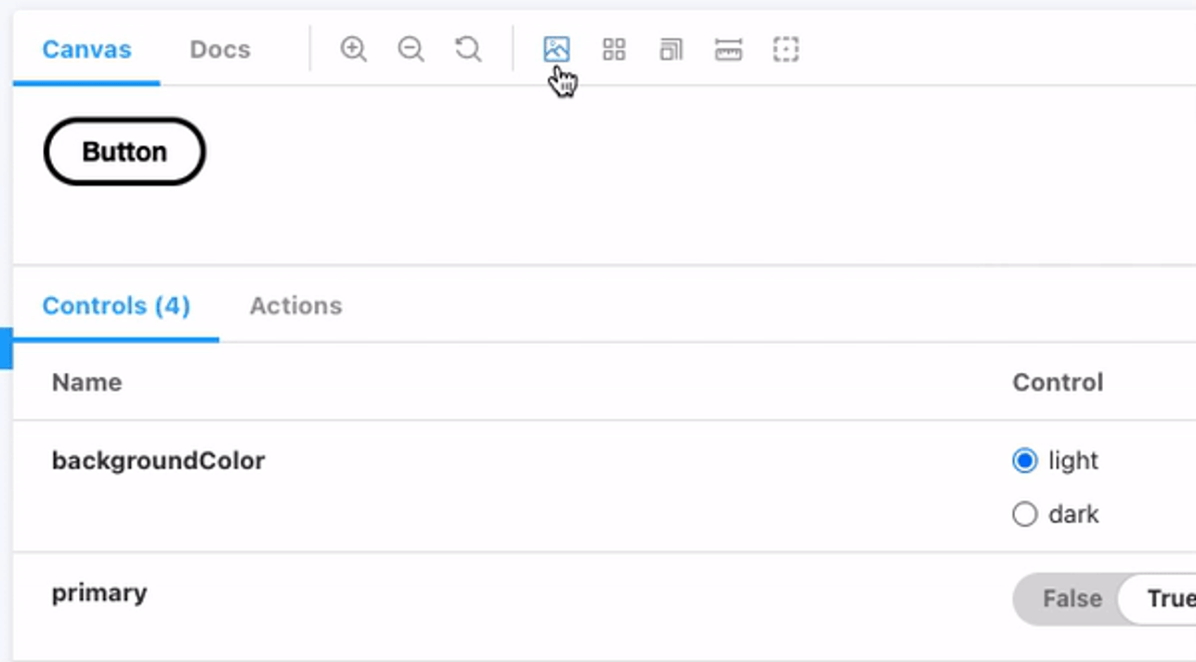
Primary.args = { label: 'Button', colorTheme: "light" };If our story did not consume the global parameter "theme" but instead used the local args parameter, we could now change the color of the button by changing the backgroundColor prop of the component. It would look like the gif below
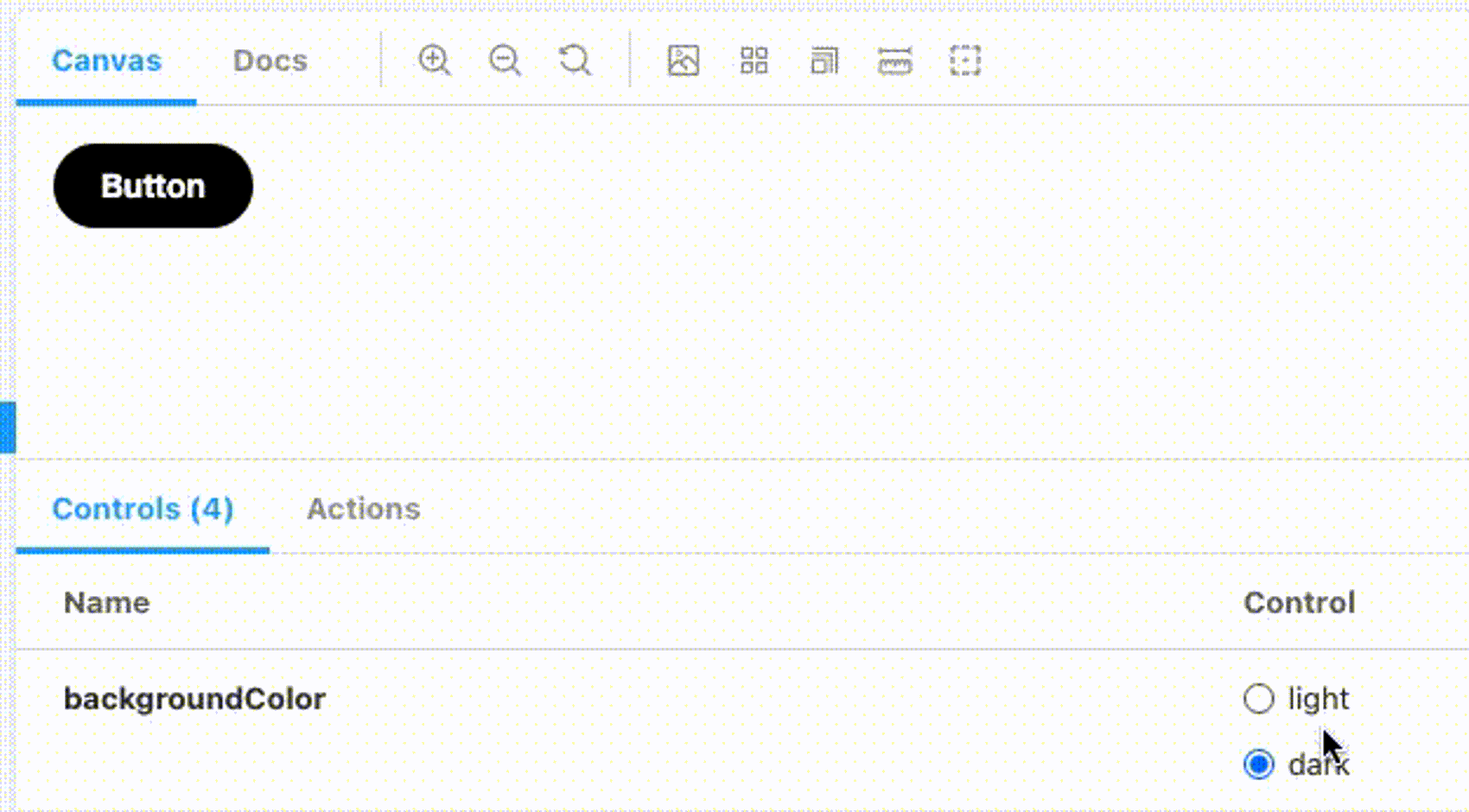
We would be able to manually change the background color through the backgrounds addon button.
It would be nice if the background changed color automatically when the backgroundColor prop changed its value. That is why we are consuming the "theme" from the global parameter. If your file is like the code above, and you can't change the color of the button anymore with the controls, don't worry. This is intentional, and needed to achieve our goal. We will tie it all together in the last step in the preview.js file.
Changing the preview.js file
Jump into the preview.js file in the storybook folder
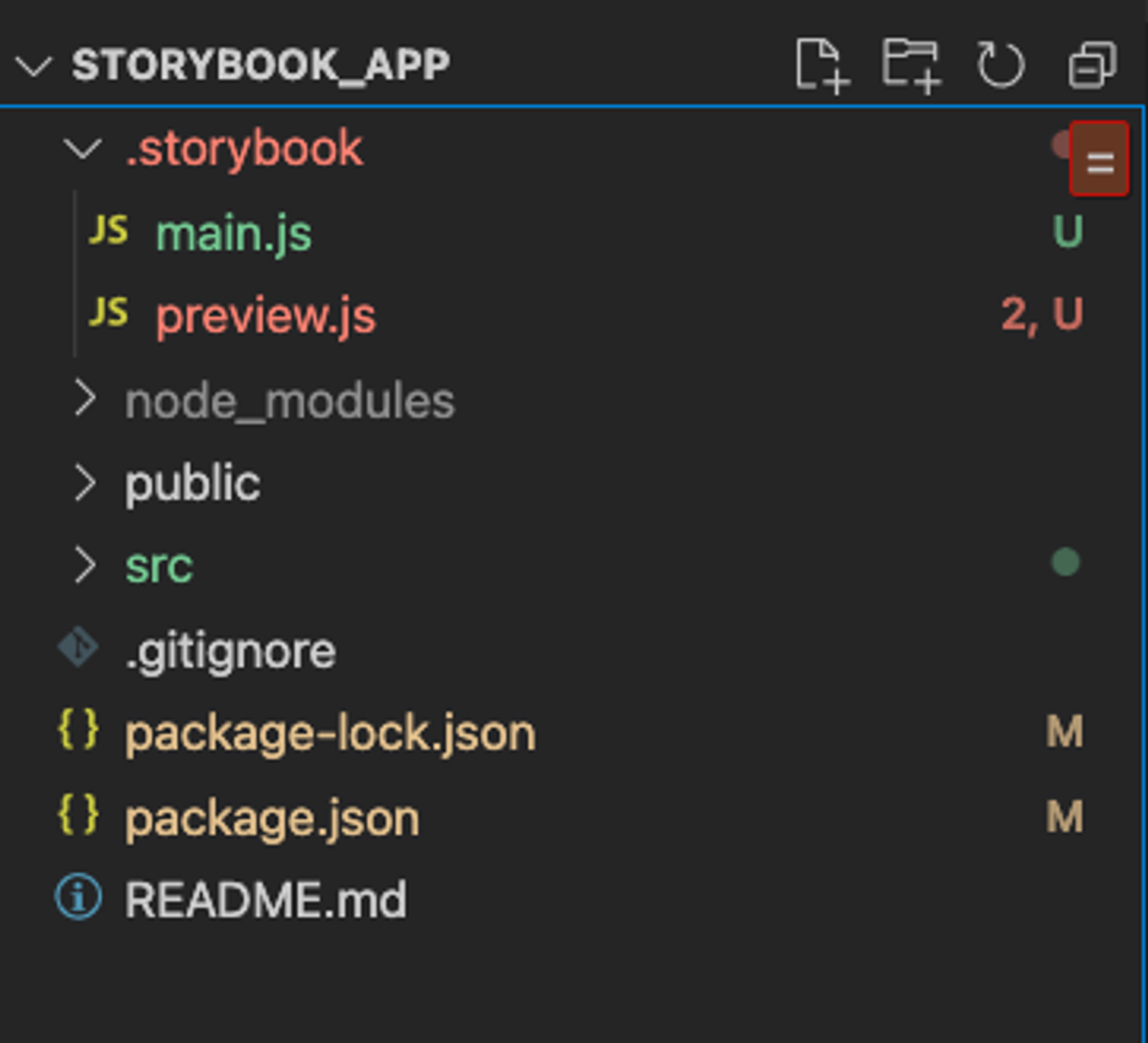
In my project I have not touched this file, except from installing the backgrounds add on. This is the only contents of this file.
export const parameters = {
  actions: { argTypesRegex: "^on[A-Z].*" },
  controls: {
    matchers: {
      color: /(background|color)$/i,
      date: /Date$/,
    },
  },
}
First lets add the background colors we want to have available in components with the colortheme prop. In the following codeblock I have only added the backgrounds object. The backgrounds are disabled, this is to prevent the background from being applied to components without a colorTheme prop.
export const parameters = {
  actions: { argTypesRegex: "^on[A-Z].*" },
  controls: {
    matchers: {
      color: /(background|color)$/i,
      date: /Date$/,
    },
    backgrounds: {
      disable: true,
      values: [
        { name: "light", value: "#F1F1F1" },
        { name: "dark", value: "#33404A" }
      ]
    }
  },
}
Next let's import two events from core-events and a channel from addons. These allow us to listen to events in storybook and run our own code whenever they are invoked.
Put these imports at the top of the preview file.
import { addons } from "@storybook/addons";
import { UPDATE_GLOBALS, STORY_ARGS_UPDATED } from "@storybook/core-events";
Next, create the channel we will use to listen to events.
let channel = addons.getChannel();we also need a listener for our channel:
const storyListener = (args) => {
  if (args.args.colorTheme) {
    let colorTheme = args.args.colorTheme;
    channel.emit(UPDATE_GLOBALS, {
      globals: {
        theme: colorTheme,
        backgrounds: colorTheme === "dark" ? { name: "dark", value: "#33404A" } : { name: "light", value: "#F1F1F1" }
      }
    });
  }
};
If you find this block of code confusing, here is an explanation. Storybook has global parameters that can be consumed by components. The background color of the backgrounds addon uses such global parameters. This is why we emit an event UPDATE_GLOBALS with the globals object and the values of globals that we want to set. In our case, backgrounds. We also conditionally set this depending on the value of args.colorTheme.
This listener takes in args, which comes from another event. It will be made clear after the next lines of code.
We now need to attach our listener to the channel whenever our story args are updated,
function setupBackgroundListener() {
  channel.removeListener(STORY_ARGS_UPDATED, storyListener);
  channel.addListener(STORY_ARGS_UPDATED, storyListener);
}
We first remove the listener already added to the event STORY_ARGS_UPDATED then we add the same listener. This is because of the lifecycle of stories in Storybook. They re-render whenever global parameters update. This way we make sure the listeners are deleted on re-renders caused by our own updates of the global parameters. Afterwards we add it again to listen to changes to story args.
The STORY_ARGS_UPDATED event passes the updated args into the listener that is added to the channel. That is how the args.args.colorTheme is accessed in the listener const in the previous step.
Lastly, call the function to add the listener to stories.
setupBackgroundListener();In the end our preview.js file should contain the following code:
import { addons } from "@storybook/addons";
import { UPDATE_GLOBALS, STORY_ARGS_UPDATED } from "@storybook/core-events";

export const parameters = {
  actions: { argTypesRegex: "^on[A-Z].*" },
  controls: {
    matchers: {
      color: /(background|color)$/i,
      date: /Date$/,
    },
    backgrounds: {
      disable: true,
      values: [
        { name: "light", value: "#F1F1F1" },
        { name: "dark", value: "#33404A" }
      ]
    }
  },
}

let channel = addons.getChannel();

const storyListener = (args) => {
  if (args.args.colorTheme) {
    let colorTheme = args.args.colorTheme;
    channel.emit(UPDATE_GLOBALS, {
      globals: {
        theme: colorTheme,
        backgrounds: colorTheme === "dark" ? { name: "dark", value: "#33404A" } : { name: "light", value: "#F1F1F1" }
      }
    });
  }
};

function setupBackgroundListener() {
  channel.removeListener(STORY_ARGS_UPDATED, storyListener);
  channel.addListener(STORY_ARGS_UPDATED, storyListener);
}

setupBackgroundListener();
The end result should be the following
Bonus explanation
The global parameter theme is what we set our component to consume. Earlier it was mentioned how the controls would no longer update the color of our component. This was because we were trying to consume a parameter that we were not yet producing in the preview.js file. At the end, it is added to every story from the preview.js file, and we actually access it from our button story, and we also change the global theme parameter by using the controls in the story
Final notes
One drawback is that the global parameter for the background color remains in the storybook state after changing story. This means that changing to another component that also has a colorTheme prop will automatically be displayed with the same background color as you last displayed a component with the colorTheme prop on. You risk showing light-theme components on a dark background, if you did not change it before browsing through the components. By disabling background-colors by default in preview.js, any story that does not set it to enabled again will always be rendered with the default white background, which means switching from a dark background story to a "no background story" works as intended. If you can figure out a way to reset the global parameter on story-change, let us know!